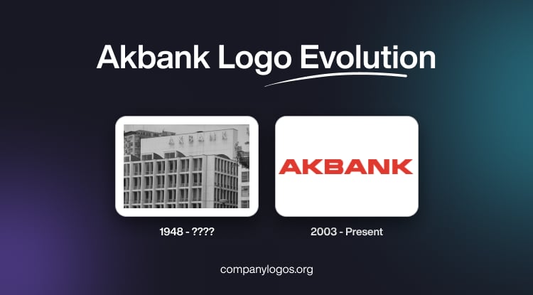
Founded in 1948, Akbank T.A.S. is arguably one of the biggest banks in Turkey. It is renowned for its innovative approach to banking and commitment to excellence. As a prominent player in the financial sector in Turkey, Akbank has adapted its branding strategies to remain relevant and connect with its diverse customer base. Interestingly, the bank’s visual identity has remained more or less unchanged in spite of a long history. The logo of Akbank conveys the achievements of the bank and its confidence. This article delves into the remarkable journey of the Akbank logo. It traces the evolution of the logo from its inception to the present day.
The Genesis of the Akbank Logo (1948 – ????)
The origins of Akbank can be traced back to 1948, when it was established to serve the Turkish people. The original logo design of the bank reflected the simplicity and elegance of the era. It had clean typography and a colour scheme that conveyed stability and trustworthiness. The logo was carefully crafted to establish the identity of the bank as a reliable financial institution that was dedicated to serving its customers.
The original logo of the bank in the form of its name can be found atop a building in sans-serif glyphs. Reminded of classic shapes, the glyphs appeared similar to the letters from a textbook that kids learn from. Although the typeface of the logo could be regarded as generic, the logo served its purpose of being stable, safe, and secure. It can be said with certainty that the design and style of the logo did not change much thereafter.

(2003 – Present)
The current iteration of the Akbank logo talks about the bank’s desire to stay ahead of the curve. It also aligns with contemporary trends in logo design and branding. The latest logo iteration features a carefully curated colour palette in red against a white background and a streamlined font, embracing minimalism and modern aesthetics. The logo variant resonates with the current brand values and vision of Akbank and garners positive responses from customers and industry experts.

The Elements of the Akbank Logo
Font
The current logo of Akbank contains the name of the bank in capital letters and is written in a bold sans-serif typeface. The design shows a sense of understated elegance, as the wordmark does not have any serifs or decorative flourishes. The style closely resembles the commercial typeface MicroSquare Bold Extended, which was published by FontSite Inc. in 2010.
Colour
Against a stark white background, the Akbank logo makes an impression, thanks to the wordmark executed in a rich and vibrant shade of red. Besides, the colour evokes a powerful symbolism of determination, strength, dynamism, energy, activity, and power. The bold colour conveys a sense of vigour and serves a practical purpose of attracting clients and setting Akbank apart from its competitors both within the Turkish and international markets.
Finally
The Akbank logo has undergone a remarkable journey, which reflects the bank’s commitment to innovation, adaptability, and customer-centricity. Each redesign of its logo has been meticulously crafted to ensure its adherence to societal trends, technological advancements, and the evolving needs of the Turkish banking sector. The evolution of the logo is proof of the resilience of the bank and its dedication to shaping a dynamic and adaptive brand identity.