Yuanta Financial Holdings traces its roots back to 1972, when it was established as Yuanta Securities Investment Trust Co., Ltd. Over the decades, Yuanta evolved from a securities firm into a comprehensive financial services provider. It did so through mergers and acquisitions across Taiwan and Asia. The company’s visual identity, including its logo, has reflected these changes. It symbolises its heritage as well as its ambitions. The article delves into the evolution of the Yuanta Financial Holdings logo since its inception.
The Genesis of the Yuanta Financial Holdings Logo (1961 – 2007)
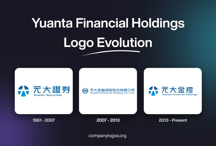
Prior to the founding of Yuanta Financial Holdings, the company used to be called Yuanta Securities, which was established in 1961. During this period, the company used a traditional logo that reflected conservative financial values. It featured a circular emblem and the name of the company written in both Chinese and English.
The circular emblem had an abstract star-like geometric shape in white against a blue background. To its right was mentioned the brand name in two levels – the top level in Chinese and in a bigger size, while the English name was written below in a smaller size and in a sans-serif typeface.

(2007 – 2013)
In 2007, both Yuanta Securities and Fuhwa Financial Holding Company merged to form Yuanta Financial Holdings. The logo of which was a refinement of the Yuanta Securities logo, where the blue circular emblem had an abstract star-like shape in blue against a white background. To its right was the full name of the newly formed company in both Chinese and English.

(2013 – Present)
In the 2013 logo version, the emblem of Yuanta Securities in blue and white was presented in a refined form. To its right is mentioned the brand name in both Chinese and English. In the latest variant, the words “Co. and Ltd” were removed.

The Elements of the Yuanta Financial Holdings Logo
Symbol
The circular star-like emblem in blue and white that is used in the logo often incorporates dynamic, intersecting lines or arcs. It suggests unity, global reach, and the interconnectedness of financial markets.
Font
The name “Yuanta” is presented in a contemporary font to emphasise clarity and professionalism.
Colour
The use of a blue colour scheme in the logo conveys trust, stability, and reliability – qualities that are essential in the financial sector.
Finally
The Yuanta Financial Holdings logo has evolved along with the growth of the company from a local securities firm to a leading financial group in Asia. Each iteration of the logo has shown key corporate milestones – mergers, expansions, and strategic shifts. In doing so, it consistently embodies values of trust, unity, and innovation. Today, the Yuanta logo stands as a symbol of the company’s legacy and its ongoing commitment to excellence in the financial sector.