Tomy is one of the most influential toy companies in Japan, with a legacy spanning over a century. Its history is marked by innovation, global expansion, and a commitment to creativity and quality in children’s entertainment. The Tomy logo has undergone a few changes over the years, and they reflect the growth, technological advancements, and the commitment of the company to innovation and playfulness. The article delves into the evolution of the Tomy logo over the years.
The Genesis of the Tomy Logo (1924–1963)
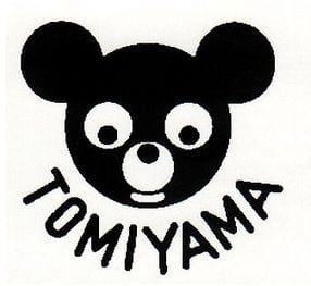
Tomy was founded in 1924 as Tomiyama Toy Seisakusho by Eiichirō Tomiyama in Japan. The original logo featured the combination of an emblem and the wordmark arched below. The emblem in black and white resembled the visage of a playful bear with rounded ears. The brand name “Tomiyama” in black uppercase and in a sans-serif typeface was arched below the emblem to give the vibe of a toy company and remain attractive to children.
(1963 – 1981)
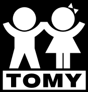
The next logo iteration of 1963 featured the playful imagery of a boy and girl in white holding hands against a bigger black rectangular background. Below them was written the brand name “Tomy” in black, bold, uppercase against a smaller white rectangular background. In an alternative variant, the colours of the logo were reversed.
(1981 – 2000)
The next logo iteration came about in 1981 and featured the word “TOMY” in bold, rounded uppercase black and red letters (separately) set against a white background. This simple yet striking design was versatile and appeared in various forms across different media, including video games and product packaging.


(2000 – 2006) (Japan/Asia); (2006 – 2014) (Japan, Secondary); (2000 – Present) (International)
The present Tomy logo features the bold brand name in blue, where one side of each individual letter is thicker and wider. Also, one side of the horizontal bar in “T” was cut at an angle to enhance style and visual acuity.

The Elements of the Tomy Logo
Font
The wordmark in the Tomy logo is written using a bold and rounded sans-serif font that conveys a friendly and approachable image. The font style is simple yet distinctive and is designed to be easily readable and appealing to children and families.
Colour
The colour scheme used in the Tomy logo is blue to symbolise trust and reliability while maintaining a lively appearance.
Finally
The Tomy logo and its various iterations over the years show how the company has evolved from being a local Japanese toy maker to a global leader in play and entertainment. Each iteration of the logo has captured the spirit of its era using bold simplicity, digital animation, or symbolic celebration. The Tomy logo has stayed true to the mission of the company of inspiring and delighting generations of children and families worldwide.