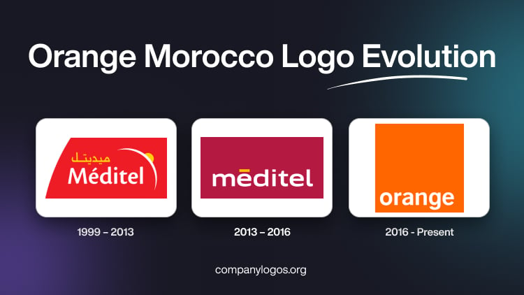
Orange Morocco, formerly known as Méditel, is a major telecommunications operator in Morocco. Its brand identity in the form of its logo has undergone a few changes over the years. The changes reflect both local market dynamics and its integration with the global Orange Group. The evolution of its logo shows the strategic shifts made by the company and its broader branding journey of Orange as an international telecommunications leader. The article delves into the evolution of the Orange Morocco logo over the years.
The Genesis of the Orange Morocco Logo (1999 – 2013)
The original Méditel logo was distinct from Orange’s visual identity. It featured the white wordmark “Meditel” in the title case and was written using a sans-serif typeface. Placed against a red rectangular background with a curved side, the wordmark in a yellow Moroccan script also appeared above the English variant. To the right of the two wordmarks was the curved image of a crescent moon in white and a small orange circle symbolising the sun at its centre.

(2013 – 2016)
The first major change to the Meditel logo took place in 2013, wherein the red rectangular background gave way to a brown one. At the bottom of the rectangle appeared the brand name “Meditel” in white lowercase and in a sans-serif typeface.

(2016 – Present)
On December 8, 2016, Méditel officially became Orange Maroc and adopted the global Orange brand identity. The rebranding was part of Orange Group’s strategy to unify its international operations under a single, recognisable brand, especially across Africa and the Middle East. The new logo replaced Méditel’s design with the iconic Orange logo.
It features a minimalist orange square with the wordmark “orange” in lowercase using a white Helvetica font and placed at the bottom of the square. This change signalled a commitment to simplicity, modernity, and global consistency. Besides, the new logo aligns Morocco’s operations with the international image of Orange.

The Elements of the Orange Morocco Logo
Font
The wordmark in the Orange Morocco logo employs a Helvetica-based typeface in lowercase to symbolise modernity and approachability.
Colour
The colour palette used in the Orange Morocco logo is orange, which symbolises warmth, energy, and innovation. The colour is both the brand’s name and its visual signature.
Finally
The Orange Morocco logo has evolved from being the local identity of Méditel to the globally recognised Orange square. It encapsulates the journey of the company toward international integration and modernity. The adoption of the Orange logo in 2016 marked a key moment, and it aligned the telecom landscape of Morocco with a brand synonymous with innovation, simplicity, and connectivity worldwide.