Electronic Arts (EA) is arguably one of the most influential companies in the video game industry. Since its founding in 1982, EA has played a critical role in shaping the landscape of interactive entertainment. It began as a champion of game developers and has since evolved to become a global publishing powerhouse.
The Electronic Arts (EA) logo is one of the most recognisable emblems in the gaming industry, which symbolises decades of innovation, creativity, and global influence. The logo has undergone several new iterations to reflect the growth, technological advancements, and the evolving brand identity of the company. The article delves into the various logo changes of the company, among others details, over the years.
The Genesis of the Electronic Arts (EA) Logo (1982 – 2000)
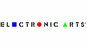
The first EA logo was introduced in 1982, and it was a geometric and conceptual design. It featured the light grey inscription “Electronic Arts” in uppercase beneath three distinct shapes in blue and white: a square, a ball (circle), and a triangle. These shapes symbolised the three pillars of the company’s philosophy—creativity, technology, and entertainment.
The colour blue was used for the emblem, as the colour is associated with communication, networks, and mental processes. This original logo was known for its abstract, almost artistic approach. It aligned with EA’s early vision of treating developers as “software artists” and positioning the company at the forefront of digital creativity.

(1993 – 1997)
The 1993 logo showed the brand name in a contrasting colour scheme. The square (in blue), ball (in red), and triangle (in light green) were made smaller and incorporated in the brand name. These geometrically shaped figures in their miniature forms replaced certain letters in the wordmark. For instance, the square represented the letter “e”, the circle represented the letter “o”, and the triangle represented the letter “a”. The typeface to write the brand name looked like a stencil having short broken lines.
(1995 – 1997)
The 1995 logo iteration showed a simple wordmark in black against a white background without any graphical element. The font used to write the wordmark was geometric with long and thin serifs, which was similar to Copperplate FS Bold from FontSite Inc.

(1997 – 2000)
The 1997 logo refined the previous version, comprising the brand name using a classic serif typeface in black. The best part of the logo remained the elongated serifs adorning the ends of the bars.

(2000 – Present)
In 2000, EA, especially its Sports division, came up with a creative monogram formed out of the interconnected letters “E” and “A” in black uppercase. Crafted in a thick and bold geometric style, the letter “E” appeared to be broken at the top, and the bottom half was fused to the bottom of the letter “A” to form a monogram. In fact, the letter “E” was formed of two thick and wide parallel stripes. The letter “A” did not look conventional, as its horizontal bar with a slanted cut did not meet the left leg of the letter.

(2000 – 2020)
Another logo iteration of the era consisted of the “EA” monogram in blue. Mirroring its other version, this logo in light blue had the brand name written below in light grey using asymmetric serifs. The font similar to it is Fremont Regular from FontSite Inc.
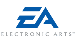
(2006 – Present)
In the 2006 logo variant, the stylised “EA” monogram in white is enclosed within a solid black circle. So, even though the colour palette and typeface were similar, the logo looked different and more confident.

(2020 – Present)
The current logo is a combination of the “EA” monogram and the brand name, albeit in a new colour palette of coral red. The stylised white monogram was placed within a coral red circle to the left, and the brand name in the same colour palette and using a modern, strong sans-serif typeface, to the right.

The Elements of the Electronic Arts (EA) Logo
Font
The logo of Electronic Arts has the letters “E” and “A” arranged in a distinctive, italicised style. The letter “E” is crafted from two parallel horizontal lines that are joined by a sharp angle. The letter “A” seamlessly connects to the lower end of this angle to create the impression that it is an extension of the letter “E”. Inspired by this unique typographic approach, designers on platforms like Behance and 538Lyons developed a similar typeface, which they referred to as the EA emblem font.
Colour
The current logo of Electronic Arts is rendered in a timeless monochrome scheme as well as coral red. It uses black and white and coral red for maximum versatility and visual clarity across any background. This minimalist colour palette marks a departure from the earlier logos of EA, which prominently featured bold, contrasting colours such as blue, red, and green.
Finally
The EA logo and its variations show the journey of the company from a pioneering software house to a global leader in interactive entertainment. Each iteration of the logo has balanced simplicity, symbolism, and adaptability. It has ensured the EA brand remains fresh, relevant, and instantly recognisable to gamers worldwide.