Nerf is a well-known toy brand from the USA, which is known for water guns and foam dart blasters. Founded by the Parker Brothers in 1969, the company is now owned by the Hasbro company. The initial journey of the brand started with producing indoor safe balls, but with time, it expanded to include ammunition made from polyurethane foam and weaponry made of foam. Nerf provides a wide range of products that emphasise safe, active play, innovation, and customisation.
The Nerf logo has undergone several changes since the brand’s inception in 1969. These changes reflect the brand’s evolution from a simple foam ball toy to a dynamic and sporty toy blaster brand. The article provides a detailed overview of the history and evolution of the Nerf logo, among other details, over the years.
The Genesis of the Nerf Logo (1969 – 1990)
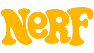
The first Nerf logo was introduced with the brand’s launch in 1969 and coincided with the release of its initial product, a safe-to-use foam ball. This original logo featured the brand name in a predominantly yellow colour scheme with letters written in a fantasy, informal font. Notably, the letters “N”, “R”, and “F” were capitalised, while the “E” was in lowercase, which gave the logo a playful and childlike feel.
The design was simple, with wide lines, irregular glyphs, and rounded corners. It evoked the sense of a painting by a child rather than formal typography. This logo remained in use for about two decades and established Nerf’s identity as a fun and safe indoor toy brand.
(1990 – 1992)
In 1990, Nerf updated its logo to a more mature but still informal design. The yellow letters remained but were complemented by darker shades and new colours such as red and green. Rectangular blocks appeared behind the Nerf wordmark, which added a sense of depth and complexity. The letters were less whimsical than before. They appeared more skilfully drawn but retained some hand-drawn qualities. This logo marked a transition from the purely playful to a slightly more structured identity, though it lasted only two years.
(1992 – 1998)
The 1992 redesign moved Nerf’s logo toward a more professional appearance. The font became more refined with creative serifs and curved diagonal bars on letters like “R” and “N”. A blue circle was added in the background to symbolise the original foam ball product. It appeared along with a purple shape with white dots, thereby adding dynamism and a sense of motion. The italicised font and diagonal elements suggested activity and energy, which aligned with Nerf’s growing product range beyond simple balls. The playful warmth of earlier logos diminished and was replaced by a more polished and dynamic look.
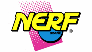
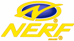
(1998 – 2003)
From 1998, Nerf embraced a sporty, professional logo design that resembled a sports team emblem. The serif font was dropped in favour of a standard italicised typography, and the letters “E” and “R” were joined at the bottom. An emblem was introduced to the logo above the brand name that featured a stylised “N” in front of a blue ellipse with a yellow border. This logo emphasised Nerf’s identity as a brand associated with action and competition rather than just children’s toys.
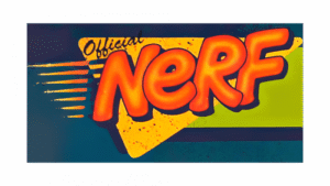
(2003 – 2004)
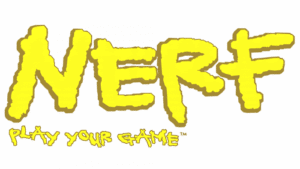
The 2003-2004 logo reverted to a childlike style where the letters appeared as if finger-painted by a child. It had irregular lines and a playful, informal feel that was similar to the original 1969 logo. Below the brand name was mentioned the words “Play Your Game” in a playful but smaller size. This design in vibrant yellow with a brown shadow was short-lived but highlighted Nerf’s roots in creativity and fun.
(2004 – Present)
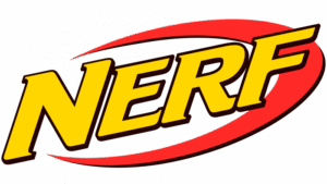
In 2004, Nerf returned to a more mature and sporty logo. The yellow colour was made darker with a brownish tint and set against a white background. A red swoosh was added to the right of the brand name to emphasise speed and energy. This logo reflected Nerf’s focus on high-performance blasters and competitive play.
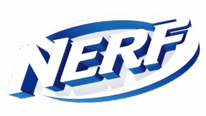
Alternative variant (2010–present)
In 2010, an alternative version of the above logo appeared with a blackish background, which added a more intense and bold visual identity. This logo remained in use for several years and became strongly associated with Nerf’s modern product line.
(2020)
In 2020, the logo variant featured a sleek 3D effect with the brand name rendered in white with varying shadows of blue. A gradient highlighted the 3D aspect of the logo to add depth and dimension. The surrounding arc and the letters cast subtle shadows and enhance the three-dimensional feel. This modern design aligned with Nerf’s contemporary image as a cutting-edge, dynamic toy brand while maintaining its sporty and energetic roots.
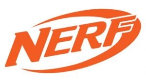
(2020 – Present)
The latest logo variant was also introduced in 2020, and it features the brand name in a similar style with an arc in an orange colour palette but in 2D.
The Elements of the Nerf Logo
Font
The current Nerf logo employs the Letraset Crillee Italic typeface created by Dick Jones, Vince Whitlock, and Peter O’Donnell in 1980 – 1987. The typeface is bold with short triangular serifs.
Colour
The colour palette used in creating the Nerf logo has been quite consistent over the years. The primary colour has remained gold or yellow, but not of the same tint. The additional colours used were red, black, silver, blue, and light grey.
Finally
The Nerf logo and its various iterations show how the brand evolved from producing a simple indoor foam ball to becoming an internationally recognised name in active, foam-based toys and blasters. Each logo redesign reflects shifts in branding strategy, be it from playful and informal to sporty and professional.