Ubisoft is one of the leading video game publishers in the world with a rich and dynamic history. Its journey over the years is marked by innovation, strategic expansion, and the creation of some of gaming’s most iconic franchises. It began its journey as a French family business and has since achieved the status of a global industry powerhouse. The Ubisoft journey reflects both the evolution of the video game industry and the company’s relentless drive to push creative boundaries. Over the decades, the logo has undergone several changes, wherein each reflects a new chapter in Ubisoft’s corporate identity and creative ambitions.
The Genesis of the Ubisoft Logo (1986 – 1989)
The original logo of Ubisoft was introduced in 1986, and it constituted a bold and colourful wordmark. The logo featured thick, 3D-style letters “U”, “B”, and “I” in pinkish-purple and light blue. It had the word “soft” in a cursive script resembling a handwritten white font. This vibrant design was characteristic of the 1980s and conveyed a sense of trust, calm, and assertiveness. It was fitting for a new company that was entering the entertainment software market.

(1989 – 1993)
In 1989, Ubisoft shifted to a more professional and minimalist logo. The new design was black and white, with “UBISOFT” in bold, uppercase sans-serif letters. Beneath it was written “Entertainment Software” in italics. This change reflected a desire for a more serious, business-like image, which was similar to the tech industry branding of the time.

(1993 – 1994)
Four years later, in 1993, Ubisoft experimented with a geometric and playful logo. The letters “U”, “B”, and “I” appeared in lowercase italics inside different coloured squares (green, yellow, and blue), respectively. The word “SOFT” was in uppercase black letters, and the whole logo elements were placed within a big red square. While this design aimed to appeal to a younger audience and highlight the company’s entertainment focus, it was short-lived due to its lack of success.

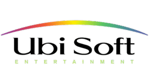
(1994 – 2003)
In 1994, after its international expansion and the launch of Rayman, Ubisoft introduced a new logo that featured a simple black serif wordmark under a rainbow arch. Below, the word “Entertainment” in a smaller size appeared in spaced-out, sans-serif letters. The rainbow symbolised universality and inclusivity and aligned with Ubisoft’s goal to create games for a global and diverse audience. This design also resonated with the colourful tech branding trends of the era.
(2003 – 2017)
A major turning point came in 2003, after Ubisoft acquired the Tom Clancy license and shifted towards more mature and diversified content. The company unveiled the now-iconic spiral or “swirl” logo. This design featured a grey spiral with an “eye” at its centre and was paired with a block-like, sans-serif “UBISOFT” wordmark. The spiral represented infinity, creativity, and the idea of being everywhere at once. This logo marked Ubisoft’s transition into a major global player in the gaming industry.

(2017 – Present)
In 2017, Ubisoft updated its logo to the current minimalist, monochrome swirl. The grey colour was removed in favour of a black-and-white, hand-drawn look. The spiral became more abstract and resembled both an “O” and a window into Ubisoft’s creative worlds. The accompanying wordmark adopted a custom “Ubisoft Sans” font. This modern design reflects Ubisoft’s focus on digital experiences, player-centric worlds, and the artistry behind its games. The logo’s simplicity also allows it to be easily animated and adapted for different franchises and media.
The spiral or swirl in the Ubisoft logo is more than a graphic—it’s a portal symbolising imagination, dynamism, and openness. It represents the interconnected nature of the gaming community and the endless possibilities within Ubisoft’s creative universes. The shift to a monochrome palette underscores sophistication and adaptability.

The Elements of the Ubisoft Logo
Symbol
The logo symbol of Ubisoft is a balanced vortex with a shifted centre. Here, the designers have deliberately steered away from achieving the perfect symmetry of the spirals.
Font
The Ubisoft logo uses the Ubisoft Sans typeface created by Colophon Founder. Developed for a French video game developer, the typeface appears similar to a modified Gilroy Extra Bold typeface. The individual sans-serif letters are simple in design, but for the letter “O”, that looks like a round chain link. It is similar to the shape of the central hand-drawn element of the logo.
Colour
The colour palette used in designing the Ubisoft logo is a monochrome black and white. Thus, although the contours of the vortex are black, the background and the gaps are displayed in white.
Finally
Ubisoft’s logo evolution shows the journey of the company from a local French distributor to a global leader in interactive entertainment. Each logo redesign has marked a new era for the company. It has adapted to industry trends and reflects the expanding vision of Ubisoft. Today’s swirl logo design stands as a testament to the brand’s commitment to creativity, innovation, and the power of immersive worlds.