
Ooredoo is a prominent multinational telecommunications company based in Doha, Qatar. Initially it was established as a telephone exchange company under the name Qtel, and with time, Ooredoo has evolved into one of the world’s largest telecom operators. It serves customers across multiple regions, including the Middle East, North Africa, and Southeast Asia.
The evolution of the Ooredoo logo reflects the company’s growth, strategic shifts, and its commitment to innovation and customer-centric services. The article delves into the logo evolution history of Ooredoo and other company details.
The Genesis of the Ooredoo Logo (1997 – 2013)
Before the rebranding to Ooredoo, the company operated under the Qtel brand. The Qtel logo was more traditional and reflected its origins as a regional telecom operator. It featured a stylish graphic and the brand name in both Arabic and English. The graphic showed a few brushed strokes in blue (small) and red (large) forming a square and a few swirls on the top left to symbolise the transmission of waves.


(2013 – 2017)
In 2013, Qtel Group was officially rebranded as Ooredoo Group, and a distinct logo was introduced to unify the company’s global presence under a single, modern brand. The logo featured the name “Ooredoo” in a distinctive, rounded lowercase font, with each letter in white enclosed in a red circle. This design symbolised connectivity, inclusivity, and the customer-centric philosophy of the company. The use of red circles conveyed energy, passion, and innovation.
Further, Ooredoo developed two logo iterations: a horizontal version for standard use and a stacked version for applications with limited space, such as social media and mobile apps.


(2017 – 2022)
In 2017, the logo was tweaked further, with the refreshed visual identity retaining the iconic red circles and the rounded lowercase font. However, the logo was made bolder, more vibrant, and distinct to reflect the company’s future-proof and customer-centric focus.

(2022 – Present)
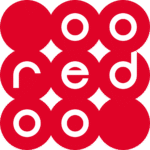
In 2022, the logo did away with the red circles and reversed the colour palette from white to red. The rounded red letters in lowercase were placed close to each other to appear connected and set against a white background. At the end a small red circle was placed on the top right of the letter “o”.

The Elements of the Ooredoo Logo
Font
The Ooredoo logo uses a custom typeface called Ooredoo-Beta, which is a modern, rounded sans-serif font designed to reflect the brand’s contemporary and approachable personality. The font features smooth, rounded edges that complement the circular shapes enclosing each letter in the logo. The font reinforces a sense of connectivity and friendliness.
Ooredoo also employs Futura, which is a clean and neutral sans-serif font known for its clarity and legibility. The combination of Ooredoo-Beta and Futura ensures consistency, readability, and a modern look across all brand touchpoints.
Colour
The Ooredoo logo is characterised by its vibrant red colour, which is the foundation of the brand’s visual identity. The red used in the logo is a bright, energetic shade symbolising passion, innovation, and dynamism. This colour choice helps the brand stand out in the competitive telecommunications market and conveys a sense of urgency and customer focus.
The History of Ooredoo
Ooredoo began operations in 1987 as Qtel Group, primarily serving the Qatari market. The company was established under Law No. 13 of 1987 to provide telephone and telecommunications services in Qatar. During its early years, Qtel focused on building foundational telecom infrastructure and expanding basic voice services.
The mid-2000s marked a period of significant technological advancement and expansion for Qtel. In 2006, Qtel launched 3G services in Qatar and formed strategic partnerships, including an equity partnership with AT&T in NavLink, which enhanced its international mobile data roaming capabilities. The company also introduced IP telephony services, signalling its shift towards integrated digital communications.
By 2010, Qtel had upgraded its 3G network and launched Mobile Money services, pioneering financial technology offerings in the region. The rollout of a nationwide fibre optic network began in 2012, delivering high-speed internet with download speeds up to 300 Mbit/s and HDTV services. That same year, Qtel initiated trials of 4G LTE mobile broadband, positioning itself at the forefront of next-generation mobile technology.
In February 2013, Qtel officially rebranded as Ooredoo Group, unifying all its operations worldwide under a single global brand. The name “Ooredoo”, meaning “I Want” in Arabic, was chosen to reflect the company’s commitment to fulfilling customer aspirations and enriching lives through connectivity.
Following the rebranding, Ooredoo rapidly expanded its footprint beyond Qatar, operating in ten countries, including Algeria, Indonesia, Iraq, Kuwait, Myanmar, the Maldives, Oman, Palestine, and Tunisia. The company diversified its services to include mobile, fixed broadband, corporate managed services, and digital content offerings.
Ooredoo has been a pioneer in the telecommunications industry, notably becoming the first operator globally to launch commercial 5G services in Qatar. The company also introduced Ooredoo SuperNet in 2015, a significant network evolution featuring three-band carrier aggregation to enhance 4G+ speeds and capacity.
Ooredoo has engaged in several strategic partnerships and initiatives to enhance its service portfolio and customer experience. For example, in January 2020, Ooredoo Qatar partnered with Indian entertainment platform Eros Now to offer localised content to its customers. In 2021, Ooredoo became the title sponsor of Qatar’s first-ever Formula 1 race, named the Formula 1 Ooredoo Qatar Grand Prix, highlighting its commitment to high-profile regional events.
Ooredoo’s presence in Oman began with the acquisition of Nawras, the Sultanate’s first privately owned telecom company, founded in 2004. Nawras was rebranded as Ooredoo Oman in 2014. The company pioneered 3G+ and WiMAX services in Oman and invested heavily in fibre-optic infrastructure. Ooredoo Oman has been recognised for its innovation and investor relations, winning awards such as the “Most Innovative Digitally Transformed Telecom Company – Oman 2023”.
Ooredoo has demonstrated strong financial performance, reporting revenues of approximately US$8.2 billion in 2019 and maintaining a global customer base exceeding 118 million by 2020. The company is publicly traded on the Qatar Stock Exchange and the Abu Dhabi Securities Exchange, reflecting its stature as a leading telecom operator in the region.
Ooredoo’s corporate vision centres on enriching people’s lives and stimulating human growth by leveraging communications technology. The company emphasises community focus and social responsibility, aiming to empower individuals and businesses across its markets through innovative digital solutions.
Interesting Facts About Ooredoo
- Ooredoo is a leading international communications company that serves more than 51 million customers worldwide as of the end of 2024. Besides, it earned consolidated revenues of US$6.5 billion that year.
- The company operates across multiple regions, which include the Middle East, North Africa, and Southeast Asia. It has a presence in countries such as Qatar, Kuwait, Oman, Algeria, Tunisia, Iraq, Palestine, the Maldives, Myanmar, and Indonesia.
- Ooredoo was named “Best Mobile Operator of the Year” at the World Communication Awards in 2013, which recognised its excellence in telecommunications services.
- It was the first operator globally to launch commercial 5G services in Qatar in May 2018.
- Ooredoo Maldives conducted the largest and most successful IPO in the history of the Maldives. It attracted more than 8,000 investors in 2017.
- The company launched one of the world’s first 5G Speed Experiences in Doha in 2017, wherein it achieved speeds exceeding 1 Gbps.
- Ooredoo’s Wataniya Mobile launched operations in Gaza in 2017. It marked the largest telecommunications investment in the Gaza Strip in nearly two decades.
- Ooredoo Oman, originally Nawras, was the first privately owned telecommunications company in Oman and has been recognised for innovation. It won awards such as the Most Innovative Digitally Transformed Telecom Company – Oman 2023.
- The company employs thousands of people across its markets—Ooredoo Kuwait alone employs around 700 talented staff driving its mission to be the number one choice for communications services in the country.
- Ooredoo has strong strategic partnerships, including with Nokia, to develop nationwide mobile networks and advanced technologies in Qatar and other markets.
- The company actively supports digital innovation and community engagement. This is exemplified by its collaboration with Plug and Play to source startups for a unique virtual experience during the FIFA World Cup Qatar 2022.
Finally
The various iterations of the Ooredoo logo show the transformation of the company from a regional telecom operator to a global communications powerhouse. The consistent use of the red circle motif and rounded typography has created a strong, recognisable brand identity that conveys connectivity and customer empowerment.