Traveling to new places is always exciting. Isn’t it?
But planning for it was a daunting task until technology made it easier. From booking flights to reserving hotels, Amadeus is the company that provides a robust IT system to the airline and hotel industry.
With the progress in technology, Amadeus also stepped up its game and reinvented itself throughout its four-decade journey. The Amadeus logo is evidence of that journey.
You’ll find exciting insight into the evolution and history of the Amadeus IT Group logo in this article.
1987-2003: Amadeus Logo for Globetrotters
The global expansion of the European airline industry in the 80s had raised the need for a resilient and computerized flight reservation system. A system that can help travel agencies by providing live flight data, and can also compete with the American GDS (Global Distribution System).
So, in 1987, four European airlines (Air France, Iberia, Lufthansa, and Scandinavian Airlines) came together to create Amadeus in Madrid, Spain. Today, Amadeus provides IT solutions to the tourism and travel industries of over 150 countries.
With this international approach, the very first Amadeus logo was launched in 1987. The logo featured a globe-like insignia made of grid-like dots. The spherical shape of this original version was in white, which stood out in contrast to the blue background.
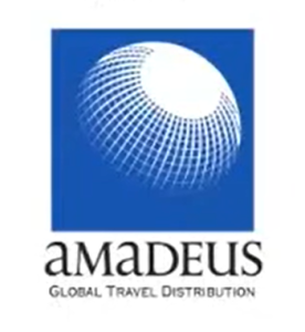
Along with the sphere, a wordmark was also included in the logo. The company’s name “Amadeus” was written in all caps except for the letters ‘a’ and ‘u’. This minor lettermark change later became the face of the brand. The font type was a sans-serif typeface.
Beneath this, they added another row of lettering, saying “Global Travel Distribution”. This font was written in title case.
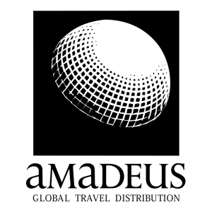
Did you know that another monochromatic version of this logo existed?
It looked like this:
2003-2005: New Millennium, New Amadeus Logo
Amadeus had already accomplished its aim for global reach by the end of 90s. The 2000s were all about new aims, new aspirations, and a new branding.
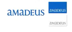
The 2003 logo of Amadeus ditched the globe, along with lettering that used to define what the brand was and what they worked for. The only thing that remained was the name “Amadeus”.
The name has become the identity of the brand and the Amadeus logo. The font type was a suave, neat, and simplistic sans-serif font with a calligraphic typography. The font color was observed to be blue.
In some cases (like events or campaigns), the name was encased in a rectangular backdrop. The color of the font also changed with the backdrop. This new redesign was just one step towards reinventing.
2005-2008: Rebranding That Shifted Perception
The new 2005 Amadeus icon precisely shows it’s another big reinventing move. The logo has some similarities to its previous iteration of 2003 in terms of usage of the brand name, font type, and color.
However, this version varies as the textmark “Your technology partner” was added below the brand name. The addition of this text mark was a critical decision, as Amadeus wanted to shift people’s perception from a global distribution system to a technology expert.
Its font type was classic sans-serif and was in black. This logo continued to be the face of the brand till 2008.
2008-2023: A Symbol Of Traveling’s Future
By 2008, Amadeus felt that the 2005 logo did not convey its redefined ambition to impact travel holistically. Hence, they decided to unveil a new symbol. It was a rather clean and minimalistic icon compared to all its previous iterations.
This time, they dropped the lettering “Your technology partner”. The new logo consists of a lettermark of the brand name in its classic sans-serif font. The As and U are in small case, and the typical blue font color still remains. But the space between each font is much wider.

This logo was breadcrumbing us to the next new remodel.
2023 – Present: A Modern Beacon
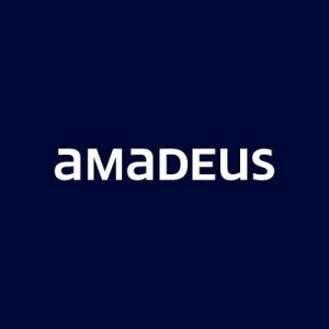
The recent logo of Amadeus was launched in 2023. This symbol was somewhat similar to its 2008 variation, like the trademark lettering that represents Amadeus’s history.
Yet it carries a freshness in imagery. The present Amadeus symbol differs in terms of the choice of color palette. The color used in the main version is navy blue or dark blue. The space between letters does not seem that wide.
A few other adaptations of this 2025 Amadeus logo are also present. The major changes in these adaptations are in the color scheme only, whether it is of the backdrop or of the font.

For instance, the negative and positive black and white versions of the logo are used in print media. Likewise, the silver version is for special cases of merchandising.
Finally
The Amadeus logo evolution tells us the story of the brand’s reinvention. What started as a system to centralize the flight reservation system later transitioned into a tech giant providing IT solutions to airlines and hotels globally.
We can clearly see this transition in its logo as well. With the very first globe emblem, they established themselves as a major global distribution system. After 2003, the brand continued to use its name as the logo inscription with a few changes in the color palette.
With them working, booking flights is literally just a click away, and that too from the comfort of our home, and we get the privilege to just focus on planning our itinerary.
In search of revolutionizing the future of travel, they became the future of travel.
FAQs
1. What type of logo does Amadeus use?
Amadeus uses the typography of its own name. The typeface is sans-serif, and the font is bold with letters like A and U in small case.
2. What is the meaning of Amadeus?
The word Amadeus in the logo means “Love of God” in Latin (ama+deus). The word has a historical significance, but it is not the exact interpretation of the brand’s representation.
3. Does Air India use Amadeus?
Yes, Air India uses Amadeus’s services. In 2022, they signed an agreement to adopt Amadeus’s Altea Passenger Service System Suite (PSS) for its customer systems.
4. What is the full form of Amadeus?
Amadeus, as such, does not have a full form, but it works as a Computer Reservation System, which is acronymized as CRS, or it can also be represented as an optimized Global Distribution System (GDS).