Renault is one of the most recognised automotive brands in the world that boasts a long and fascinating history of logo evolution. Since its founding in 1899, the French automobile manufacturer has undergone several transformations in its brand identity. The Renault logo has evolved from a simple monogram to the modern geometric diamond shape we see today. Each iteration reflects the brand’s growth, technological advancements, and changing design trends. This article delves into the various logo transformations the brand has undergone over the years.
The Genesis of the Renault Logo (1899 – 1906)
The first logo of the company was a simple yet elegant monogram that consisted of the intertwined initials of the first names of the brothers, Louis, Marcel, and Fernand Renault. This monogram appeared inside an oval medallion with a decorated ribbon. The logo was used primarily on documents and promotional materials rather than on the cars themselves. Since the automobile industry was still in its infancy, the branding of Renault was not as significant on vehicles at the time.

(1906 – 1919)
By 1906, Renault had gained international recognition, especially after winning the first-ever French Grand Prix. To celebrate this success, the company introduced a new logo featuring a front view of a Renault automobile enclosed within a gearwheel. This symbolised the engineering prowess of Renault and its growing dominance in the automobile industry. The emblem was placed on cars to establish a stronger brand identity.

(1919 – 1923)
After World War I, Renault played a crucial role in supplying vehicles and tanks for the French military. The company designed and produced the famous Renault FT-17 tank, which became an iconic symbol of military innovation. To honour its wartime contributions, Renault changed its logo in 1919 to feature a stylised tank inside a circle with a thick black outline. This was a bold move, which made Renault one of the first car manufacturers to incorporate military symbolism into its branding.

(1923 – 1925)
The 1923 logo featured the radiator grille emblem with the brand name written horizontally at the centre. The brand name was written using outlines of characters against a white background and enclosed within a horizontally stretched rectangle with arched ends. The overall circular emblem of the logo had 20 short strokes in black of equal thickness.

(1925 – 1930)
In 1925, Renault introduced what would become its most recognisable feature—the diamond-shaped logo. The emblem featured a diamond-shaped structure with horizontal lines running across it. This new geometric shape allowed the logo to be seamlessly integrated onto the front grille of Renault cars.
The diamond shape was chosen for its modern and industrial aesthetic. It also symbolises strength, durability, and innovation, which aligns with Renault’s brand philosophy. Over the years, this shape would undergo multiple refinements, but the diamond remained at the core of Renault’s identity.

(1930 – 1945)
The 1930 logo iteration was redesigned without changing the diamond shape. The new logo featured thick parallel lines in black fitting the shape of the diamond, but without any outline or framing. The central banner had the brand name written in white uppercase in an elegant serif font with large serifs and thick lines.

(1945 – 1946)
In the 1945 logo redesign, the diamond shaped emblem was placed inside a yellow shield with a thick grey and black border. Inside the emblem the French inscription “Regie Nationale Renault France” in black sans-serif was written in black in four levels and separated by thin black lines.

(1946 – 1958)
After World War II, Renault underwent nationalisation and became Régie Nationale des Usines Renault (RNUR). The company updated its logo, wherein it kept the diamond shape but refined the horizontal lines to create a cleaner and more modern look. The diamond-shaped emblem appeared in yellow, white, and black colour palettes with the wordmarks “RENAULT” and “REGIO NATIONALE” written in a modern sans-serif typeface in uppercase and in bigger and smaller sizes, respectively.

(1958 – 1967)
In 1958, Renault refined its logo further by simplifying the diamond and making the horizontal lines bolder. The name “Renault” in bold black and uppercase was now incorporated inside the diamond emblem at the centre against a white background. The rest of the diamond emblem featured a grey background with six thin black stripes at the top and bottom to reinforce the brand identity.

(1967 – 1973)
The 1967 logo redesign saw a bright yellow square with two white arrowheads facing opposite sides placed to create a rhombus-like shape. Below the yellow square was written the brand name in black uppercase and in a bold sans-serif typeface. The brand name and enclosed between two black horizontal lines.

(1973 – 1982)
In one of the most significant logo redesigns, Renault collaborated with the famous French artist Victor Vasarely. He created a three-dimensional optical illusion effect using bold black and thin black parallel lines within the diamond shape. The diamond shape was placed within a yellow square with rounded ends and a black outline. The brand name in bold black appeared below. This version became widely known as the “Vasarely Diamond” and gave Renault a more futuristic and dynamic identity.

(1982 – 1990)
In this logo iteration, the frame/outline of the yellow square was removed, and the wordmark in a serif font was replaced with a sans-serif font with large serifs. Also, the edges of the rhombus were sharpened, and the yellow shade of the background was changed to a darker one.

(1990 – 2004)
In 1990, Renault modernised its logo again and transitioned to a solid, three-dimensional diamond with smoother black edges. The upper part of the diamond was coloured white, while the lower part was coloured black. The brand name was rendered in a bold sans-serif typeface and placed below underscored by a thin black line. This version aimed to reflect Renault’s advanced engineering and its reputation for producing reliable and stylish vehicles.

(2002 – 2004)
The 2002 version saw the three-dimensional diamond-shaped emblem with metallic shading fitted into a dark yellow rectangle. The brand name at the bottom was written in a bold sans-serif typeface with massive serifs.

(2004 – 2007)
By 2004, the previous logo was further refined to make it appear more vibrant and recognisable. The yellow colour represented energy, optimism, and innovation. It aligned with Renault’s strategy of producing eco-friendly and customer-focused vehicles. The typography of the brand name was changed to Renault identite and looked more compact.

(2007 – 2015)
Designed by Eric de Berranger, the logo was a rework of the earlier logo and combined both thick and thin lines. However, the brand name in black uppercase was incorporated within the yellow square and placed below the diamond-shaped emblem with a metallic sheen.

(2015 – 2021)
In 2015, Renault adopted a more minimalist and flat design for its logo by removing the three-dimensional effects. The diamond-shaped emblem with a metallic sheen remained prominent, but the design became sleeker and more adaptable for digital media. The brand name written in a stylish custom Renault Life bold typeface in uppercase was placed below the emblem.

(2018)
The 2018 logo was a departure from the previous logo and featured thick black stripes placed horizontally in a diamond shape against a white background. At the centre of this abstract logo was the brand name written in uppercase and using a bold custom typeface.

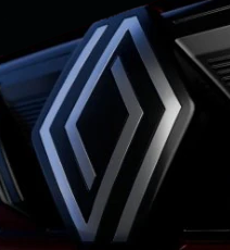
(2021 – Present)
In 2021, Renault unveiled a new flat and minimalist logo, which was inspired by the 1972 Vasarely Diamond but with a modern twist. Designed by Gilles Vital, the updated logo featured a sleek, monochrome diamond design using broken lines to represent a labyrinth. This change aligned with Renault’s transition towards electrification and digital transformation. The custom typography used to write the brand name was Nouvel R.

(2025)
The latest Renault logo is characterised by its flat, minimalist, and interlocked diamond, and is in alignment with its global “renault. rethink.” transformation strategy. To be unveiled with the new Triber, the latest logo will feature on all new product launches by the company. This signifies a move towards a human-centric, more modern, and digitally connected brand ethos.
The latest redesigned logo shows the journey of Renault by combining geometric precision with simplicity. The logo aims to convey clarity, connection, and continuity. The redesigned logo seeks to do away with additional typography and embellishments. It is designed to adapt seamlessly across physical and digital platforms.
The Elements of the Renault Logo
Font
The Renault logo has used several fonts to render its wordmarks. These include Century Gothic Bold, Compact Light, Renault MN Bold, Renault Identité, Renault Life Bold, and Nouvel R.
Colour
The colour palette used in the Renault logo has remained consistent. These include grey (silver, metallic), yellow, white, and black.
Finally
The Renault logo has undergone several transformations over the past century. It evolved from a simple monogram to a bold diamond symbol that represents innovation, strength, and modernity. Each version of the logo reflects a different phase in Renault’s journey—from its early years in automobile racing and wartime production to becoming a global leader in electric mobility.