Bentley is a British car company that builds high-performance luxury cars for the elite. It was founded by Walter Owen Bentley on July 10, 1919. Its logo happens to be a masterpiece of art and is mysterious to look at. The famed winged logo was designed by Frederick Gordon Crosby and continues to embody Bentley’s vision of speed, luxury, and performance. The article delves into the evolution of Bentley’s logo, among other details, over the years.
The Genesis of the Bentley Logo (1919 – 2025)
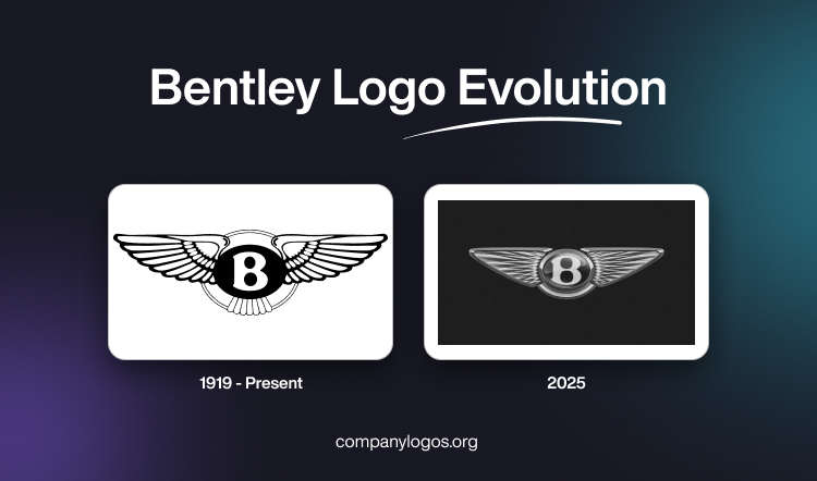
The iconic winged Bentley logo was designed by Frederick Gordon Crosby in monochrome. It featured the capital letter “B” in white inside a horizontal oval with a black background. Interestingly, the gaps in the letter “B” gave the impression of two round dies or holes for valves. To the right and left of the oval were attached wings that symbolised the flight of the founder’s dream to produce high-performance racing cars.
Besides, the wings signified the high quality of the brand and the fact that it soared ahead of its competitors. The wings are connected at the top and bottom by thin arched strips. Interestingly, the number of feathers on the right and left wings is not necessarily the same. They are mostly in the ratio of 10:11 and 13:14 for different models of the cars.

(2025)
The latest Bentley logo has been created by the in-house team of Bentley, under the direction of its director of design, Robin Page. It is a simplified version of the famed Winged B emblem where the core elements have been retained. However, the wings have been designed with a diamond pattern. Also, the feathers adorning the crest below the stylised letter “B” have been removed. The sharper and simpler shape of the winged emblem resembles the angled wings of a peregrine falcon. Besides, the letter “B” at the centre appears to be surrounded by a chamfered metal ring with a bevelled glass edge.
According to the director of design, “In an era of ever-increasing complexity and fidelity from digitalisation, an exercise of simplification and refinement is a modern necessity – and so the new emblem is cleaner, sharper, and more impactful than its predecessor.”

The Elements of the Bentley Logo
Symbol
The Bentley logo prominently features a bold, winged “B”. It is an apt symbol for the elite, aspirational automotive brand. The wings conjure notions of flight and freedom and represent Bentley’s aviation origins. These also represent the exhilaration of driving one of these ultimate driving machines. But the wings also project an air of stateliness and success. They reflect the heritage and prestige associated with the Bentley name.
Situated on top of the sleek black letter, they evoke ideas of triumph and charisma. To some, this winged icon may seem ostentatious. Yet for loyal Bentley enthusiasts, the soaring wings aptly capture the magical, rarefied feeling of being behind the wheel. The logo’s symbolism is as lofty as Bentley’s principles and clientele. It promises an exceptional experience in which owners can transcend the ordinary and take flight.
Font
The font of the Bentley logo has remained the same for almost a century, which sets it apart from many other iconic businesses. Bentley wants to emphasise its respect for heritage, which is why it chose to stick with the same font. The bold capital “B” for the Bentley brand is written in a special typeface that is only used for this purpose. Underneath the main logo, occasionally a sans-serif “Bentley” name may also be placed in full capital letters.
Colour
The colour selection for the Bentley logo has maintained consistency since the brand’s inception. It aligned seamlessly with its distinctive design. Nevertheless, diverse versions of the logo exist, depending on the context. The Bentley logo adopts classic colours such as black and white, with occasional silver hues in 3D. In the realm of colour psychology, white conveys purity, charm, creativity, and clarity, while black symbolises sophistication, elegance, and superiority. These qualities are synonymous with the essence of Bentley.
When silver makes an appearance in the Bentley logo, it serves as a symbol of modern design and British aristocracy. Over the years, standard Bentley vehicles and racing cars have occasionally embraced different colours. Notably, the oval nestled between the wings of a racing car might be adorned in green, while exclusive classic cars may showcase a red colour.
Finally
As we studied the history and evolution of Bentley’s logo, one thing became clear: the logo is more than just a symbol; it’s a reflection of Bentley’s journey through time. From the roaring 1920s to the technologically advanced 2020s, the “Winged B” has soared through decades, while embodying the perfect fusion of heritage and innovation. With Bentley continuing to redefine automotive luxury, one can’t help but be captivated by the timeless wings that have carried the brand through a century of excellence.