Aerospace is considered one of the best innovations of the 21st century; likewise, Germans have proved their mettle in the field of engineering. What comes next when we mix both?
Deutsche Lufthansa AG, commonly known as Lufthansa – a high and mighty German aviation group.
The Lufthansa group is now a pioneer in the aviation industry with its 300+ subsidiaries and expertise in all major air business sections: passenger, logistics (Lufthansa Cargo), maintenance, repair, and overhaul (MRO) services with its Lufthansa Technik.
The evolution of the Lufthansa logo is evidence of their rich and vast history. Let us uncover the Lufthansa logo meaning and unravel the psyche behind the Lufthansa logo design.
1917-1926: The Insignia That Started It All
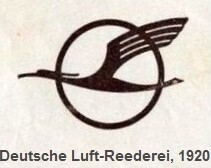
In December 1917, the Deutsche Luft-Reederei (shortened DLR) started operating as the first German airline, founded by industrialist Walther Rathenau. This airline later turned out to be the foundation stone of both today’s Lufthansa Group and its unforgettable Lufthansa logo bird we all know about.
The brain behind the first Lufthansa logo in 1918 was Otto Firle, a German architect and graphic designer. This logo also featured in Lufthansa’s crew uniforms at the time.

The logo showcases a crane-like figure swaying its wings, uncooped in a circular ring. The feathers are seen to be connected by a single line. The circular ring cannot fully encapsulate the crane.
1926-1953: The Year of Great Mergers and Changes
On 6th January 1926, the Reich state forced Deutscher Aero Lloyd (renamed after the first merger of Deutsche Luft-Reederei and Lloyd Luftdienst) to merge with Junkers Luftverkehr AG. They relaunched themselves under the name of Luft-Hansa.
Does that ring a bell?
Yes, you are right, this is the exact name that would later become a famous brand.
This Germanic core word translates to “Air Guild” in English. Luft is air in German, and Hansa is an acronymized version of the Hanseatic League – a powerful league of German merchants of medieval times that controlled trade over northern Europe.
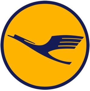
This new Lufthansa brand now needed a new logo as part of its first major rebranding. The Lufthansa logo in 1926 was heavily inspired by its predecessor in 1920. The new logo had some significant changes.

The color of the blackdrop was strikingly yellow, with a vibrant blue circular ring surrounding it.
The crane’s body was sleeker, which was angled in such a way that it seemed to be flying upwards. The selection of the blue color for the crane was a smart move, as blue represents the brand’s aerial association.
This version of the Lufthansa logo sustained until the end of the Second World War.
1953-1963: The Rebirth of Lufthansa
After the Allies won World War II, they seized the airline for being a part of the nazi authority and contributing to the war. By 1951, they dissolved Lufthansa completely.
But on 6th January 1953, with a joint partnership of the Federal Republic, the German National Railway, the state of North Rhine–Westphalia, and a few minor private holders, the airline was reborn as Aktiengesellschaft für Luftverkehrsbedarf (Luftag) in Cologne, Germany.
The federal government already owned the right to the Lufthansa logo and name. So they thought to rebuild this new national airline with a familiar name, which can revive trust amongst Germans.
That’s how they chose Lufthansa.
With this newfound identity, Lufthansa needs a refreshed logo that can change people’s perspective towards them and convey the message of their new start with reliability.

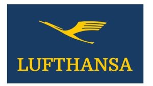
For this, they ditched the circular shape of the insignia that they had been using for decades and replaced it with a more modern and structural rectangular backdrop in blue.
The famous crane still made a place in the symbol, but now with a new addition of a wordmark spelling Lufthansa in all bold, both in yellow. The font chosen for the wordmark is a strong and solid serif typeface, which gives a neat look to the logo.
They followed the original color palette as it created a sense of nostalgia and assurance with the German public. The brand continued to use this logo until 1963.
1963-2018: The 4th Rebrand with Global Expansion
As Lufthansa expanded globally, it needed a new logo to represent its impressive growth.

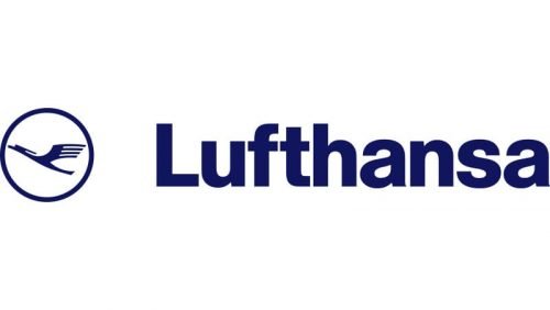
This new symbol had some major elements of the 1926 design. Lufthansa brought back its iconic crane in the enclosed circle. However, the crane was much sleeker than all its previous iterations.
This time, the wordmark was alongside the logo, precisely at the right side. The name was written in title case, and the font type was a mixture of bold sans-serif and Helvetica typeface.
This time, the choice of color palette was a solid blue against a white background. Otl Aicher, the designer behind the new crane emblem, made a bold move by removing the yellow. This yellow was so exclusive to the Lufthansa logo that it was known as Lufthansa yellow.
This redesign of 1963 received both kinds of feedback. Some said that it’s like stripping the brand’s identity, while some said it’s more of an elusive move to show their arrival at the global level.
2018-2025: Logo that Embraces Modernism
Ronald Wild, the new Lufthansa logo designer, created this logo in 2018, which was retained until November 2025.
![Lufthansa logo [2018-2025]](https://companylogos.org/wp-content/uploads/2025/01/lufthansa-group-logo-2018.png)
This logo clearly delivers minimalism through its design. The redesign does not have many drastic changes from its previous iteration, but it still looks more elegant and crisp. The circular emblem encasing the crane is much leaner, while the crane picturization is the same as its previous versions.
The wordmark used in the Lufthansa logo is a custom sans-serif. There is a slight change in the color palette. Although it is still all blue, it has a matte finish.
2025-Present: Lufthansa Symbol Celebrating a Century
The new Lufthansa logo of 2025 is a celebration of its 100-year journey. This version also carries its iconic crane, but now the crane is much slimmer. The outlines of the crane are sharper and more precise. The circle surrounding the crane is now gone.

Apart from this, a slight update in the inscription was done. The word “Lufthansa Group” can be seen now instead of just Lufthansa. This shows the complete unification of the earlier segmented group. Now, their various subsidiaries and different services come under one umbrella unit.
The backdrop color has become richer as they are using six contrasting shades of blue, which blend effortlessly. This also depicts six stages of flight, from ground to sky, which shows Lufthansa’s ability to excel in multifaceted tasks with ease.
Finally
Throughout its 100-year history, Lufthansa has undergone many changes. It faced many challenges during the war and at one point was on the verge of extinction. But what remained consistent was its iconic crane logo.
The Lufthansa logo went through six iterations, representing mergers, global expansion, consolidation of its subsidiaries, and the 100-year milestone.
Today, the Lufthansa Group is synonymous with quality service and excellence in the aviation industry. There might be several airlines with the eagle logo, but there is only one with the crane, and that’s Lufthansa.
FAQs
1. What does the Lufthansa symbol mean?
The Lufthansa logo consists of many elements, but the constant entity of the symbol is the crane – a bird known for its precise yet graceful movements.
2. Why is the Lufthansa Logo a Crane?
The crane inthe Lufthansa logo was inspired by Otto Firle’s 1918 illustration for the uniform of Deutsche Luft-Reederei (a German airline of 1917). This airline was also known as the earliest predecessor of the current Lufthansa Group.
3. Why did Lufthansa change its logo?
In 2025, Lufthansa elevated from a group of airlines to a more structured airline group that offers expertise in varied fields. Hence, this new logo is a calculated move rather than merely a redesign.
4. Who was the designer of the Lufthansa logo?
The earlier Lufthansa logo design was designed by Otto Firle in 1918. Later in 1963, Otl Aicher was appointed as the new Lufthansa logo designer. He was succeeded by Ronald Wild, who has been working from 2018 to the present.