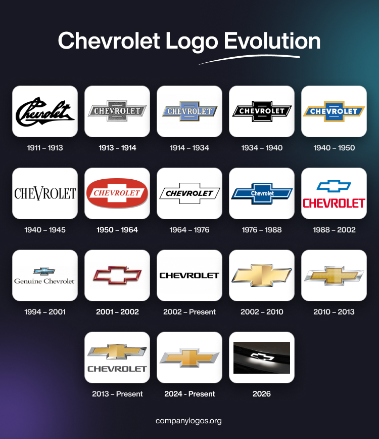
Chevrolet is one of the largest automobile companies in the United States with a product line that includes both passenger and commercial vehicles. Founded in 1911 by Louis Chevrolet and William Durant, the company is presently owned by the General Motors Company.
The inaugural Chevrolet logo was introduced in 1913 and featured an exquisite bowtie. Legend has it that Durant found inspiration for this design from the wallpaper of a French hotel. The resulting bowtie symbol, both uncomplicated and unique, emerged as a timeless emblem. It paved the path for a lasting symbol. The article delves into the logo iterations of Chevrolet and discusses their significance.
The Genesis of the Chevrolet Logo (1911 – 1913)
The original Chevrolet logo comprised the signature of the founder, Louis Chevrolet, in black. The wordmark depicting the logo was written in a bold and distinct handwritten typeface.

(1913 – 1914)
The year 1913 saw the first geometric logo, which was also the forerunner of all future logos of the company. The logo featured a horizontally extended cross with diagonal ends and straight ends for the vertical element. In the foreground of the cross was written the brand name in bold uppercase in a fancy serif typeface. The individual letters in white had black shadows to give them a three-dimensional look. Two short lines appeared at the top and bottom of the letter “R,” arguably to highlight the brand name. The cross would get the “bowtie” nickname going forward.

(1914 – 1934)
The year 1914 saw the advent of the bowtie emblem in a light blue, gold, and white colour scheme. It was a rehash of the earlier design involving a greater refinement of the “cross” and inscription. The redesigned logo looked elegant and sophisticated.

(1934 – 1940)
The previous bowtie design was improved upon by changing the colour scheme to monochrome. Besides, the typeface of the bigger letters was made into a modern, bold, sans-serif one. Also, the white letters of the brand name were contrasted against the black background of the bowtie emblem.

(1940 – 1950)
The redesign of the 1940 logo saw the return of the blue and gold colour scheme. However, the blue background was made brighter to contrast with the white letters in the foreground. The gold frame of the cross made the logo look royal and attractive.

(1940 – 1945)
In 1940, another logo redesign appeared without the bowtie emblem. It featured the brand name in a simple, black, uppercase, sans-serif lettering. The letter “V” in the middle was made bigger to look like a stylised victory sign or a bird.

(1950 – 1964)
In the redesign of 1950, the logo featured the bowtie emblem in white enclosed within an elliptical red background with a grey shadow at the bottom. And the brand name in red italics appeared in perfect contrast to the overall red background.

(1964 – 1976)
The year 1964 saw arguably the most minimalist logo in monochrome. The black italicised wordmark in uppercase was placed inside the bowtie emblem with a thin black outline.

(1976 – 1988)
The logo design of 1976 featured the bowtie emblem with a blue background, thin white outlines, and black shadows on the periphery. Also, the size of the brand name in white lowercase was reduced considerably to fit in the centre.

(1988 – 2002)
In 1988, the logo featured the bowtie emblem with a thick blue outline and sans any wordmark inside. In fact, the wordmark was placed just below the emblem in red, uppercase against a white background.

(1994 – 2001)
The 1994 redesign saw a three-dimensional variant of the Chevy logo. The bowtie emblem got a thick silver framing and a gradient and glossy blue background showing a maze of white streaks converging at the centre. The wordmark below the emblem “Genuine Chevrolet” was written in black using an extended serif font. The letters exhibited delicate serifs and sleek lines.

(2001 – 2002)
The 2001 logo redesign saw only the three-dimensional bowtie emblem with a dark red or bronze framing. Looking modern, the emblem had a white background and no accompanying wordmark.

(2002 – Present)
In 2002, the text-based logo featured the brand name in uppercase and in a black custom typeface against a white background. The lettering with smooth, thick lines and a few connected letters, “EV” and “ET,” is often seen in metal or on posters and printed materials.

(2002 – 2010)
The year 2002 saw the first gold bowtie emblem with a silver framing. This powerful three-dimensional metallic design represented the growing popularity, stability, and strength of the company.

(2010 – 2013)
The golden bowtie design of 2010 got a makeover of sorts with the addition of small dots forming a texture. And the brand name that appeared below the emblem was written using a narrowed black typeface.

(2013 – Present)
The redesign of 2013 logo was a subtle refinement of its previous iteration. Here, the golden bowtie was made to appear more luxurious by adding a thick, glistening silver framing. Also, the previous variant of the wordmark in a black typeface was retained.

(2024 – Present)
The latest logo design shows the bowtie emblem in a bright and dark shade of gold with a thick grey framing.

2026: Chevrolet’s New Monochromatic Badge
Chevrolet gave a sneak peek of its upcoming logo update at the teaser launch for the new 2027 Chevy Sonic RS on 15 April 2026. This newly imagined SUV coupe is all set to make its mark on the roads of Brazil next month.
The changes are subtle, which seems like a deliberate step for a smoother transition of evolving the brand’s identity. The new bowtie is slightly wider and flatter than its previous iteration, resulting in a more streamlined, horizontal configuration. The proportions have been refined to feel sleeker and more modern, considering the shift in car logo design towards minimalism.

With a major switch from gold to black, the logo appears in illuminated and chrome variants, depending on the trim level. The car will bear this refreshed emblem on multiple touchpoints: the upper front, the grille, the tailgate, the 17-inch wheel center caps, and the steering wheel center.
Interestingly, despite this revamp, Chevrolet is not completely giving up on the classic gold bowtie logo. As a matter of fact, it will continue to represent the brand on current models and gradually shift to the new badge with the Sonic RS, followed by additional models in 2027.
“The change follows the trend of slimmer headlights and grilles due to the evolution of lighting, propulsion, and even manufacturing resources. All of this is connected to the brand’s new global identity”, said Alexandre Ameri, Head of Design, GM South America.
With this statement, Ameri made it very clear that the update is not synonymous with the rise of electric vehicles, but rather a natural response of the brand to the changing design language of modern cars.
The Elements of the Chevrolet Logo
Symbol
Chevrolet’s recognisable bowtie emblem has stood for the innovative and dependable nature of the business for more than a century. Since its inception, the emblem’s distinct crossing form has not changed. It went through innumerable versions, changing from plain black and white to vibrant colour schemes. The powerful, angular bowtie shape is primarily made up of two overlapping geometric forms: a horizontal parallelogram crossed by an inline square. This produces a timeless representation of Chevy’s history.
This traditional crossover design has endured through time. In addition, Chevy’s identity was maintained despite decades of technological advancement and shifting consumer preferences. It goes without saying that the bowtie remains one of the most recognisable trademarks in the history of automobiles.
Font
Chevrolet’s forward-thinking brand image is reflected in its strong, current sans-serif typeface. The typeface’s uniform stroke weights and proportions give it a visually balanced, stable appearance. The rounded letter connections provide an accessible smoothness, while the squared letters give a sturdy, grounded look.
Like a thread connecting the brand, Chevrolet’s connected ‘e’ gives visual cohesion. The outcome is a multipurpose, eye-catching typeface that conveys Chevrolet’s history of dependability and creativity. The font, like the brand’s recognisable bowtie insignia, is a timeless representation of Chevy’s constant commitment to quality and style.
Colour
Chevrolet’s current logo colour scheme carefully combines old and modern design elements. Elegant metallic silver and gold tones showcase the brand’s century-old history while keeping an eye towards the future. The warm, dazzling gold brings back memories of Chevy’s vintage logos. It strikes at the business’s continuous dedication to fine craftsmanship.
The metallic colours have a clean, futuristic design while referencing the newest production technology, which is counterbalanced by colder silver tones. This elegant metallic colour palette establishes Chevrolet’s position as a pioneer in innovation while paying attention to the company’s long-standing heritage.
Finally
You can take a trip through the history of automobiles by tracking the development of the Chevrolet logo. From the modest beginnings of the bowtie in 1913 to its sleek, contemporary symbol today, it has symbolised creativity, dependability, and the everlasting spirit of Chevrolet. To keep up with the times, the company altered its logo as styles and technology changed. Actually, the bowtie is evolving beyond a simple style choice. It represents a company that has endured and made a big impact on the automobile industry.