Ayurveda, the gift of nature that India understood and preserved. A knowledge so ancient that it feels deeply knitted into Indian tradition. This potent and viable knowledge was shared with the world many times, but not in the way Forest Essentials did it.
The renowned ayurvedic skincare brand owned the roots wholeheartedly and introduced them into a world of luxury. Let us go through the journey of the Forest Essentials logo in this article.
2003-2020: A Blooming Forest Essentials Logo
Mira Kulkarni started Forest Essentials in 2000 as a hobby with an investment of just two lakh rupees. She launched limited but nature-imbued products like soaps and candles.
This hobby soon turned into a full-fledged business when the brand started receiving bulk orders from big players.
As the company expanded, so did her product range, now providing skin and hair care. With the expansion came a logo that matches the brand’s aura.
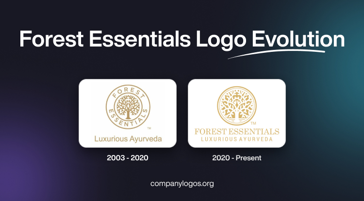
The old Forest Essentials logo features a tree in the middle of layered circles. The lush branches extend toward the inner circle. The brand name features in between the ringed space of the inner and outer circles.
The Forest Essentials logo font appears in a classic uppercase sans-serif.

Underneath this circular symbol, the tagline ‘Luxurious Ayurveda’ appears in the title case and thin sans-serif typeface. The brand presents the logo and tagline in a golden hue.
The designer at Green Goose Design explains the thought behind the logo design of Forest Essentials. They revealed that their goal was to achieve a modern yet traditional look for the brand.
2020 – Present: A Ripened Symbol
The premium Ayurvedic products hooked everyone up. Forest Essentials’ place has now changed from small sections in multi-product stores in India to a standalone shop in London. Now that’s what we call a leap of success.
The new logo for Forest Essentials has some major touch-ups. You can easily notice the reverse color scheme of gold and white. The redesign scales up the white tree to improve visibility. The horizontal line near the tree base separates it from the canopy. The reduced spacing between two concentric circles is overcome by increasing the width of the outer circle.

The designers removed the wordmark from the logo. Now it appears beneath the emblem and on top of the tagline. The wordmark beneath the circular logo is in uppercase, modern serif and sans-serif typefaces.
Centdegrés, the brain behind this revamp, understood the balance that the brand tried to create between nature and beauty and incorporated it into its visual identity.
In 2026, a major American cosmetics company, Estée Lauder, acquired the brand. As this acquisition unfolds, it will be interesting to see how the brand’s logo evolves under this new ownership.
Finally
The Forest Essentials logo is deeply rooted in tradition, yet has a modern-day feel. The tree in the circle showcases the company’s botanical origin. Throughout its two iterations, the tree always stayed in the limelight.
The 2020 redesign looks symmetrical and clear, like the enlarged size of the “tree of life” and horizontal lines near the tree’s base.
This version also witnessed the change of the brand name placement from inside the logo to beneath it.
FAQs
1. Which font is the Forest Essentials logo?
The designers at Centdegrés used modern serif and sans-serif typefaces in the logo for Forest Essentials.
2. Which company bought Forest Essentials?
The Estée Lauder Companies bought Forest Essentials in 2026. The company first came across the brand in 2008 when it invested in Forest Essentials.