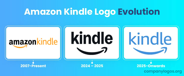
This article explores the history and evolution of the Amazon Kindle logo. It traces the journey of the logo from its inception to its current form.
The Genesis of the Kindle Logo (2007 – Present)
The Kindle logo was introduced alongside the first Kindle device. It was designed to complement the Amazon logo as well as establish its own distinct identity.
The Kindle logo can be divided into two components. The first one is the Amazon logo in black, which contains a curved arrow of yellow-orange colour as described in the above.
The second component is the word “Kindle,” rendered in the same colour scheme as the curved arrow. The choice of using the word Kindle in the logo was proposed by brand consultants Michael Patrick Cronan and Karin Hibma.
The logo features thin, sans-serif letters that closely resemble the Bliss Regular typeface.

(2024 – 2025)
In 2024, the logo was redesigned to make it appear more stylish and simpler. To drive home the importance of “Kindle”, the logo did away with the “Amazon” wordmark. Instead, the wordmark “kindle” in black lowercase was written in a bold sans-serif typeface and set against a white background. The iconic arrow symbol symbolising a smile appeared below in black.

(2025 Onwards)
The 2025 rebranding of Amazon Kindle was carried out as part of the major transformation of the Amazon brand. The new logo was designed by Koto, and it featured subtle changes to the 2024 logo. The wordmark “kindle” in lowercase was written using the Ember Modern typeface.

The Extended Version of the Amazon Kindle Logo
In addition to the standard Amazon Kindle logo, there is an extended version of the logo used as well. The version contains a realistic silhouette of a boy reading from a Kindle sitting under a tree. The overall silhouette is black and set against a blue sky to appear as evening or the approaching night. Also, the word “Kindle” appears in bold yellow in the upper section of the logo written in the typeface of the original logo.
There is an alternate version of the logo as well, which was introduced in 2017. In this iteration, there is no tree and the boy’s silhouette covers the whole space. The background sky was shown in a light blue colour with tiny white stars added. Besides, the logo did not have anything written on it, unlike its earlier iteration.


The Elements of the Amazon Kindle Logo
Font
The latest Kindle wordmark is written using the Ember Modern typeface
Colour
The new colour palette for the Kindle logo is white.