PepsiCo is the holding or umbrella company for Pepsi and several other brands. Established in 1965, the company is one of the largest food and beverage producers and distributors globally. PepsiCo has a strong visual identity with an emblem and a wordmark. It comprises a globe made of meridians and parallels in different colours. Each colour on the globe represents a brand owned by the company. The article delves into the evolution of the PepsiCo logo over the years.
The Genesis of the PepsiCo Logo (1965–1985)
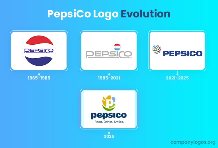
The original logo of PepsiCo, the umbrella company, was conceived in 1965, the year of the inception of the company. The iconic logo, which is still visible on any Pepsi bottle, featured a globe in three colours: red, white, and blue, from top to bottom, respectively. The colours represented the colours of the American flag, and the idea behind the conceptualization of the logo was clearly inspired by patriotism.
The circle or globe was formed by wavy lines and symbolised the two merged entities: Pepsi and Frito-Lay. Also, the wordmark in the middle was rendered in a custom sans-serif typeface in blue. The underlined part of the logo was meant to convey the important role of Pepsi in the new umbrella entity. Moreover, the fact that the underline connected both Pepsi and Co. into one showed the birth of the company through a merger. Further, the fact that both “P” and “C” were shown bigger than the rest of the letters in the wordmark highlighted the names of the companies they represented before the merger.

(1985-2001)
In the 1985 logo iteration, the wordmark became the centre piece of the logo. Executed in light grey, it was similar to the previous wordmark in style and typeface. The globe emblem comprising meridians and parallels in grey was placed above the letter “I” of the wordmark, albeit in a much smaller size. The globe indicated that PepsiCo is an international company.

(2001-2025)
In 2001, the logo was redesigned to reflect the expansion of the company after the acquisition of Gatorade, a sports drink company. Commissioned by a top consulting, design, and research company in America, Landor Associates, the logo was redesigned to convey a modern, popular, and environmentally friendly image of the company. Further, the colours of the globe, meridians, and parallels were changed to represent the diverse entities owned by PepsiCo.
For instance, blue symbolises water, orange symbolises juices, green symbolises health, and white symbolises dairy products for children. On the right bottom side of the globe emblem appears the wordmark “PEPSICO” in blue to show the brand’s confidence, reliability, great possibilities, and ability to scale.

(2025)
The new PepsiCo logo introduced a new brand identity that comprises a multicoloured graphical emblem and a blue wordmark. The graphical emblem shows the letter “P” emerging from a smile and is surrounded by a water droplet and a leaf. The water droplet and leaf signify liquid for the beverages and grains for the snacks. The smile symbolises customer centricity.
In other words, the symbols represent the values of PepsiCo, namely, customer centricity, sustainability, and great taste. The wordmark is written using a new custom typeface in lowercase to convey approachability and inclusivity. The tagline to the logo reads “Food. Drinks. Smiles” as the defining attributes that encapsulate the brand.

The Elements of the PepsiCo Logo
Colour
The PepsiCo logo incorporates a multicoloured palette that captures the optimism, energy, and ambition of the company. The palette shows the rich soil that nourishes our drinks and food. Besides, it represents the commitment of the company to the people and the planet.
Font
The typeface used is a custom one in lowercase letters that conveys a sense of approachability and inclusiveness. In other words, the font reflects the consumer centric spirit of the company.
Finally
The evolution of the PepsiCo logo proves the brand’s ability to adapt to changing market dynamics and consumer preferences. From being “Brad’s Drink” to its current minimalist design, the logo reflects the history of the company and the broader cultural shifts in branding and design.