Can you believe that a logo chosen only because it was the least unlikable option, mocked as a dead fish, dubbed “the stripe” by its own creator, and even dismissed by the brand’s owner, would go on to become so iconic that we can identify the brand by it alone?
Well, that’s the story of the Nike logo.
Seems unbelievable, right? But you’ll be forced to believe it once you know how it became a universal symbol for swiftness and athletic prowess.
This article traces the journey of Nike’s Swoosh.
1964 – 1971: Before Nike Swoosh Logo (Blue Ribbon Sports Era)
What fuels our souls is passion, and if you’re iron-willed enough, the same passion can lead you to greatness. The story of the Nike logo is no different. Phil Knight, Nike’s founder, was the kind of person who always found a way to come back stronger.
After failing to make it on the high school basketball team, Knight enrolled at the University of Oregon in 1955 and competed in Bill Bowerman’s track program. At the time, Bowerman was already a respected track and field coach, well known for his innovative methods that gave his athletes a competitive advantage.
This man later teamed up with Phil to create “Blue Ribbon Sports.” They began importing and distributing the “Tiger running shoes” from the Japanese brand Onitsuka Shoe Company (predecessor of Asics) to the U.S. Blue Ribbon Sports became the foundation of Nike.
Founded in 1964, Blue Ribbon Sports centered its mark around a bold monogram of its initials. The interlocked letters B, R, and S are rendered in a thick, outlined style and doubled with multiple strokes that move parallel to the outlines.
These strokes also extend to connect the letters R and S at the end. The overlapping and interlocking created a compact and unified mark that gives a visual feel of a running track. A small registered trademark symbol sits in the upper right corner of the monogram.
Beneath the monogram, the distribution company’s full name, “Blue Ribbon Sports,” emerged in a sans-serif display typeface with all capital letters. The first letter of each word (B, R, and S) rises noticeably higher than the remaining letters.
1971 – 1976: When The First Nike Logo Breathed
The company soon started selling the pairs in good numbers. Despite this, Knight was unsure about the company’s future as their contract with Onituska was coming to an end. He knew that to grow, the brand needed its own shoe, an identity that they could call their own.
So, in February 1971, with the help of Bowerman’s innovative Tiger-based design, Knight created a black soccer cleat with a white sole, a simple silhouette but entirely theirs.
The shoe was ready, but a new problem arose. They didn’t have a unique mark that could set them apart from others. This is where the story of the Nike logo took an interesting turn.
The $35 Logo by Carolyn Davidson
If you’re stubborn enough to seek, you can find the answer even in the most unexpected places. Knight met Carolyn Davidson when he taught accounting at Portland State University. The graphic design student was working her way through school when Knight offered her $2 per hour for various graphics for his side business. This time, he asked her to create something bigger, a mark that would be the sketch of a global empire.
Among the dozens of options Davidson submitted, the founders selected a curved checkmark. Knight famously remarked, “Well, I don’t love it, but it will grow on me.” The mark became the first Nike logo when it appeared on the company’s shoes. Along with a $35 fee, Carolyn Davidson etched her name in history as the creator of the Nike logo.
Jeff Johnson, Blue Ribbon Sports’ first full-time employee, solved the naming problem. Inspired by an article in an in-flight magazine about famous brand names such as Kleenex and Xerox, which have two syllables and an exotic letter like a Z, X, or K, he had a dream.
The next day, he delivered the word “Nike” to the office, explaining the story about the iconic brand and that the word also refers to the Greek winged goddess of victory.
Davidson explained the Nike logo’s inspiration, suggesting that the stripe conveys the idea of motion. The emblem laid the hollow stripe over a wordmark. The signature-like, handwritten “Nike” sat in lowercase, flowing cursive script.
The fluid letterforms follow traditional pen-based writing with thin upstrokes and heavier downstrokes. The checkmark wraps around the text in a thin, clean outline. This all-black 1971 Nike logo showcased the brand’s first identity when they needed it most.
1976 – 1989: A Nike Logo With Bolder Identity
Soon, a problem surfaced with the 1971 Nike logo. The italic, cursive, and lowercase “Nike” was creating confusion. The “n” looked too much like “m,” making people read it as “Mike” instead of “Nike.”
Since a logo is a brand’s first point of recognition, and this one wasn’t doing a great job, Nike refreshed it in 1976. Acknowledging the problem, the brand recreated the “NIKE” logo in all-caps, bold letters. The italicized wordmark that appeared on the swoosh sat in bold Helvetica.
The hollowed-out stripe (famously known as the swoosh) gained mass and looked more structural and solid with its elongated tail. It touches the lettering through this tail at E. This Nike black logo marked a new change.
1989 – 1992: The New Nike Logo Comes in a Box
Over time, Nike grew and became a prominent sports shoe brand. With the brand’s evolution, the next logo makeover arrived in 1989.
Aware of the influence of its swoosh logo and bold wordmark, Nike didn’t experiment much in this version. By simply swapping the color with the background, they created a significant difference in the imagery.
The swoosh seems sleeker and sharper, making it more prominent. The text in this Nike logo design also appears in white. The black rectangular backdrop highlighted the curves and cuts of both elements. The logo also appeared in other color variations, like white on red or vice versa.
1992 – Present: Nike Logo Changed to a Standalone Swoosh
Like Adidas’s trefoil stripes, people also started linking Nike with its stripe-like checkmark. Popularly known as “the swoosh,” the symbol has single-handedly carried Nike’s story as its logo since 1992.
What’s interesting is that earlier, it wasn’t known as the “swoosh.” Phil used the term “Swoosh fiber” to describe the nylon upper of shoes, which somehow caught on later, though we can’t put a finger on exactly when.
Even today, the swoosh delivers the spirit of Nike, and Phil’s statement explains that easily: “What we wanted it to stand for was speed, which it did and still does. But now it means much more than that. It symbolizes the best in sports. And it did grow on me!”
The black Nike logo (the black swoosh against white) is the one the brand uses primarily. Nevertheless, the white Nike logo (white swoosh against black) can also be seen in some digital and promotional spaces.
Why Did Nike Reverse Its Logo?
Nobody wants to mess with something that they created with so much effort, but Nike isn’t a nobody. Driven by the principles of their first marketing head, Rob Strasser: perfect result count, not a perfect process. Break the rule, fight the law. They flipped, reversed, and spun the swoosh in every possible way that can make one dizzy.
The first time Nike turned its swoosh around was in 1994, with the Nike Air Darwin. The shoe carries the swoosh backward near the heel. Nike’s reverse logo appears similarly on the Nike Air Yoke (1995), Nike LeBron 10 (2012), and Nike Air Max (2015).
On the Nike Air Flare (1994) and Air Jordan 1 High Travis Scott (2019), it appears on the side.
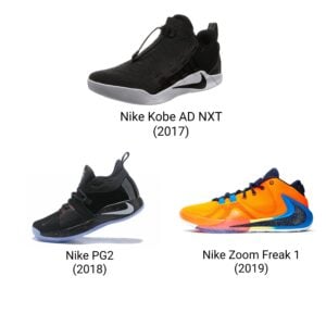
This odd swoosh was engraved on the sole of the Nike Kobe AD NXT (2017), Nike PG2 (2018), and Nike Zoom Freak 1 (2019).
The Nike Air Ndestrukt (1995) wears this inverted swoosh on its collar (the top opening that wraps around the ankle).
An upside-down swoosh is also considered a reverse logo, seen on the Nike Blazer Mid 77 Vintage Slam Jam (2018) and Air Jordan 1 Shattered Backboard.
Honorable Mentions: Other Nike Logos
The timeline of Nike’s logo history tells us a lot about the swoosh. But the story of the Nike logo doesn’t end there. Some other variations of the symbol are detailed below.
Nike’s ‘Just Do It’ Logo
Dan Wieden (Wieden+Kennedy) was assigned to work on an ad campaign for Nike. Dan was puzzled by not coming up with a single idea that could unite the different Nike ads under one message.
That was when he remembered the last words of Gary Gilmore, which he had read. “Let’s do it” was what the prison inmate said before facing death. Talk about gloomy. Dan adapted it into the “Just Do It” tagline for the 1988 campaign, which was also featured along with the Nike logo.
The tagline typically appears in a bold, all-caps sans-serif typeface, making it impossible to skip.
The Sunburst Logo
Not too long after adopting the checkmark, Nike started imprinting it on its products. Though on shoes, the swoosh alone looked perfect, when the brand slapped it on a shirt or bag, the single mark just felt awkward and off-balance.
Jeff Johnson took it upon himself to fix that. In 1976, he started experimenting with the swoosh. Drawing inspiration from the 1972 Olympic design, he duplicated it and laid it in a circular pattern, creating what is today known as the “Sunburst” or “Pinwheel” logo. Geoff Hollister, Nike’s third employee, wasted no time pressing it on tracksuits and other running apparel.
Finally
The history of the Nike logo is the tale of the brand’s evolution from a shoe distributor to a shoe creator. In its pre-Nike era, when the brand operated as Blue Ribbon Sports, the logo depicted the brand’s initials as a running track.
The 1971 shift gave birth to “the swoosh,” which clung to the lowercase “Nike” text in a calligraphic, freehand typeface. Over time, this dependent hollow checkmark got bolder, refusing to stay under the wordmarks’ shadow.
By 1989, it appeared boxed in various colors. Then, in 1992, it broke free, leaving the wordmark behind to stand alone as the sole claimant of the Nike logo.
FAQs
1. Who made the Nike logo?
Carolyn Davidson created the Nike logo. She called it “the stripe” before it gained the famous moniker “the swoosh.” She was a design student, studying at the same university where Phil Knight used to teach accounting.
2. What is Nike’s current logo?
The current logo that binds the Nike brand and its subbrands under one identity is a standalone checkmark called the swoosh. It is a minimalistic stroke that starts as a curved hook with a broad base, gradually extends upwards, and narrows to a point at the end.
3. Where did the Nike logo come from?
When Carolyn Davidson was designing a brand mark for Nike, Phil gave her a brief on what it should represent. A mark that can capture the idea of speed and swiftness. This brief led her to the creation of the most recognizable logo in history, now depicting the innovation and possibility that Nike brings.