There are a few brands whose names and visual identities evoke imagery that also reflects their literal meaning. The Target logo is one of them. In branding, this is known as descriptive symbolism.
Founded in 1962 as a discount store by the Dayton company, Target is known for selling trend-forward merchandise at affordable prices. The Target logo, also known as the Bullseye logo, is among the most recognisable logos. With a minimalist design, modern font, and geometric balance, the logo conveys a sense of purpose and goal.
Let’s have a glance at the history of the Target logo and how it evolved into a signature symbol of the brand.
1962 – 1968: First Target Store and the Origin of the Bullseye
In 1962, John F Geisse and Douglas Dayton started a discount store called ‘Target’ for the Dayton Company. The name represented the store’s goal of hitting the “bullseye” in terms of “retail goods, services, commitment to the community, price, value, and overall experience”. It is for the same reason that the classic bullseye logo was envisioned.
Stewart K. Widdess, the Director of Publicity at Dayton, is credited with the early naming and visual identity efforts at Target.
To mimic the bullseye, designers used three concentric rings, which were thick in form and light red in color. The white space between them increased contrast. Moreover, they placed the wordmark along the centre of the rings, making the name and message clear. The lettering was bold, italic, and black in a serif typeface.
The 1962 Target logo represented the popular retail brand for six years, as it was discontinued in 1968 due to its legibility problems.
1968 – 1974: Introduction of the Classic Bullseye
In 1968, the original Target logo underwent a major redesign. Designer Eugene Bellini from Unimark International spearheaded the rebrand.
The design team separated the wordmark from the Bullseye icon and placed it to the right, making it easier to read. The lettering was an all-caps sans-serif typeface in a black outline font on a white background.
In addition to that, they revamped the Bullseye icon. This smaller, simpler, and more symmetrical design had a single solid red circle surrounded by a thick red ring with white space in between. The use of brighter and bolder red enhanced the look.
With this, the red Bullseye icon that we see today came into existence. It gradually evolved into an instantly recognisable symbol of the brand.
1974 – 2004: A Stronger and Bolder Identity
In 1974, the retail giant further refined its primary logo. Instead of a black outline, they used a solid black color for the wordmark’s lettering. As a matter of fact, the use of bolder, straighter, and wider letters made the logotype easily readable from a distance.
This version went on to represent Target for nearly three decades. From 2004 to 2018, it also continued as a secondary logo of the brand.
2004 – 2018: The All-Red Target Logo
In 2004, the second major redesign took place. This time, the wordmark shifted to the bottom of the bullseye icon. Moreover, its size was significantly smaller than the previous iteration. For the first time, the word “Target” also appeared in red, making it a single-color logo system.
This update simplified the design and made the bullseye icon the centre of attention. The 2004 Target logo continued till 2018.
2018 – Present: The Target Logo of Today
In 2018, Target hit a milestone of having stores in all 50 states of the United States and also earned the distinction of being the most popular department store in America from YouGov. By then, it owned several private-label brands as well as the retail shipment company Shipt.
A company of that stature needed a branding update.
Target modernized the logo with a simple change. Following in the footsteps of major brands like Amazon and Facebook, it changed all letters of the wordmark to lowercase.
With this design update, the current logo of Target looks friendlier and more approachable, offering a casual connection with the brand. In the age of technology and digital-first use, this was a smart move as the logo needed a visual balance for screen view.
Other Target Logos and Variations
Over the years, the Target Corporation has used other versions of its logo for various purposes. Different wordmarks have been added and removed, but the Bullseye icon has been a common feature.
Logos of Different Store Formats
From the early 1990s to the mid-2010s, Target used separate names for its various store formats, each featuring its own distinct logo.
Target Greatland Logo
Target Greatland was a large hypermarket format introduced in the 1990s. To mark the distinction, the “Greatland” wordmark turned up in the brand’s then-official logo in a cursive font just beneath “Target”. The use of green color was a highlight.
Later, the Greatland stores converted into regular Target stores in 2009.
SuperTarget Logo
A bigger supermarket format, SuperTarget, made its way to American streets in 1995.
Similar to Greatland, the logo incorporated the “Super” lettermark in cursive and green. But unlike Greatland, where the two wordmarks were stacked, “Super” and “Target” appeared in the same plane, with the ‘r’ of Super touching the ‘T’ of Target since “SuperTarget” was a single word.
The SuperTarget logo, which predates Target’s 2004 all-red primary logo, drew attention for using red for “TARGET”. Another noteworthy element was the green underline.
Upon the introduction of the all-red Target logo in 2004, the SuperTarget logo was updated in 2006. The text moved to the bottom of the bullseye icon, with the two lettermarks split and stacked. “Super” was now red and no longer cursive. Although in uppercase and the same typeface as “TARGET”, it appeared different due to its thin lettering.
In an alternate version, “SUPER” featured to the left of the bullseye symbol and “TARGET” to its right.
CityTarget Logo
CityTarget was a small-format Target store introduced in 2012 for densely populated urban areas. Its logo had the wordmark “city” in lowercase letters, sans-serif typeface, and red color, along with the Bullseye mark. Notably, no “Target” logotype appeared alongside.
TargetExpress Logo
In 2014, an even smaller-format store, TargetExpress, was established. A minimal logo similar to that of CityExpress showed the lettermark “express” in lowercase, sans-serif typeface, and red color, right next to the bullseye emblem.
In 2015, Target dropped the names SuperTarget, CityTarget, and TargetExpress. Since then, all their stores, regardless of size, have simply been called “Target”.
No Wordmark Target Logos
In some editions, the Target logo doesn’t carry the wordmark. Apart from featuring on Target-branded products and apparel, it’s used for a wide variety of purposes, including merchandising, shopping carriers, corporate communications, and advertising campaigns.
Another variation of the Bullseye symbol also exists with black rings on a white background. It is used in corporate materials and as signage for some of their office spaces. An alternate version of the same includes white rings on a black background.
Target Drive Up Logo
In 2017, Target introduced ‘Drive Up’, a pickup and delivery service for customers shopping through the Target app. The Drive Up logo features a graphic art image of a delivery van with the bullseye sign on a white shopping bag inside it.
The Bullseye Mascot
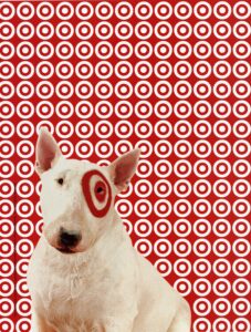
Bullseye dog, a white English bull terrier with the Bullseye logo on its left eye, is the official mascot of the Target corporation. It was introduced in 1999 as part of an advertising campaign “Sign of The Times”.
Finally
The Target logo is a brilliant design form that clearly communicates the brand’s goal. It is symbolism at its best. Over the years, designers refined the logo, but the Bullseye has remained central to the concept.
From a single store to having a store within 10 miles of more than 75 per cent of Americans, Target has come a long way. Its success bears the mark of being a goal-oriented company, which has been perfectly represented by its logo.
Needless to say, Target’s logo has truly hit the bullseye.
FAQs
1. What is the Target Bullseye logo?
The Target Bullseye logo is the official logo of the American retail store chain Target. Structurally, it’s a solid red circle surrounded by a red ring with white space in between.
2. What is the Target logo color?
The Target logo is bright red in color, with both of its elements, the Bullseye icon and the Target wordmark, being red. In the earlier logo versions, the wordmark was black in color. Black and white versions of the Bullseye symbol also exist, which are used in corporate materials and as signage for some of their office spaces.
3. How many red circles are there in the Target logo?
The Target logo, also known as the Bullseye logo, has one red solid circle surrounded by a red ring with white space in between. The original version of the logo, introduced in 1962, had three red concentric circles with white spaces in between.
4. What does the Target symbol mean?
The Target symbol is the shape of a bullseye. It represents the company’s goal of hitting the “bullseye” of a joyful and affordable retail shopping experience.