While delivery apps have proven to be a boon for introverts, I’d like to talk about their special section…Fashion apps!
Apps that not only saved them from gut-wrenching small talk with salespeople but also made them fashionable.
And not just them, fashion apps have changed our styling and shopping habits as well.
One standout example is Ajio. Since its launch in 2016, the app has taken the fashion market by storm. In this article, we’ll explore that swirling phenomenon through the Ajio logo journey.
2016 – Present: Ajio Logo Steps Up E-commerce Fashion
Launched in April 2016, under the watchful eyes of its parent company, Reliance Retail, Ajio aimed to be an ultimate fashion destination for Indian fashionistas. This e-commerce platform offers curated choices of apparel, accessories, and footwear for everyone, from international fashion houses to local textiles.
Ever noticed how the name Ajio sounds familiar? That’s because this term carries the company’s online persona, like Reliance’s telecom brand, Jio.
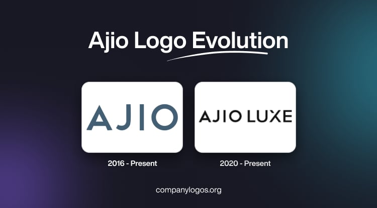
The fashion and lifestyle brand Ajio’s logo oozes simplicity, functionality, and modernism. The company uses its name as the main logo. The wordmark is in uppercase, and each letter contains copious space between them.
The Ajio logo font is an understated sans-serif typeface. Despite using a structured and angular lettering, the logo carries a subtle softness. The J looks quite different compared to the other brands like JBL or Johnson & Johnson.
That’s because its arch does not look like the traditional ‘J’ that goes up to the mid-partition. The symmetry in the letters’ orientation and alignment is quite noticeable.

We can immediately recognize the ajio symbol through the bold and vivid ajio logo color code. The company uses Blue Bayou (#496379) as its primary color. This dark, muted blue gradient has a cool undertone and is grayish-blue in appearance.
2020 – Present: An Opulent “Ajio Luxe” Logo
In 2020, Ajio extended its forte by launching Ajio luxe. One-stop for all premium brands for tasteful Indian consumers. The brand later added this section to its existing Ajio app, which launched on 3rd September 2016.

The logo for Ajio Luxe is very similar to the Ajio logo, except for the addition of “Luxe.” The luxe here represents its core focus area, which is luxury brands. This wordmark follows a similar minimalist sans-serif typeface.
The distinctive feature of the logo is its X. The top-left stroke of the letter is half-sliced and removed before its intersection. The remaining visible part aligns perfectly with the other letters, giving the logo a uniform look. Using a slightly different jet-black font sets the Luxe logo apart from the Ajio logo.
Finally
Since its origin in 2016, the Ajio logo hasn’t changed a bit, but it has stayed relevant and fresh in today’s time. Its contemporary style made the logo useful, and the color palette choice made it timely. The letters have a geometric edge to them and are in congruence.
The Ajio Luxe logo has the same futuristic approach. This logo proficiently declares its identity and purpose. The extra inscription “Luxe” and its styling deliver the motive of this Ajio’s extension.
The Ajio logo design can be a masterclass for those who want to nail the logo design at first attempt.
FAQs
1. What is the logo of Ajio?
The logo for the fashion and lifestyle brand Ajio is the brand’s name itself. It uses a sleek and simplistic sans-serif typeface that has some geometric elements and structural regularity.
2. What is the color code of the Ajio logo?
The primary color used for the Ajio logo is Blue Bayou (#496379). It has a grayish-blue appearance. On the other hand, Ajio Luxe uses a jet black palette for its logo. In both versions, you’ll notice uniformity in the color gradient.
3. What is the inspiration for the Ajio logo?
The brand name is the inspiration for the Ajio logo, which is taken from ‘Jio’, another one of Reliance’s subsidiaries.