We always feel fascinated when we get to visit a castle and learn about its history. What if I told you that heritage is not just a castle, but can be an institution as well?
One such heritage is the Toronto-Dominion Bank, otherwise known as TD Bank.
Although it came into existence in 1955, its history is far beyond that, and all historic institutions have one thing in common: An intriguing emblem. Let’s delve into this fascinating story of the evolution of the TD Bank logo.
1955 – 1969: The Dawn of the TD Bank Logo
As you may have deduced by the name, the Toronto-Dominion Bank was formed from the merger of the Bank of Toronto, which was chartered on March 18, 1855, and the Dominion Bank, which started in 1871 in Ontario.
Both the banks had experienced a boom in their assets post war, which had almost doubled since 1939. As they were entering a global market, they realized that the cost of expansion was much higher than the individual asset value, and they were in stiff competition with larger banks.
Therefore, they decided to form a union with a bank of equal size, which would open more doors of opportunities in this post-war economy. On February 1, 1955, the Bank of Toronto and the Dominion Bank amalgamated and became the Toronto-Dominion Bank.
And that’s how the first Toronto-Dominion logo came into existence. The logo took inspiration from its predecessors. The insignia was round, and the name of the union around it, just like the crest of the Dominion Bank.

This brown logo also had a heraldic shield icon, which was divided into three sections. The top section has a gold lion in motion on a red background. The middlemost section consists of a red horizontal band across the center on a gold backdrop, and the bottom section has three maple leaves in gold on a red background.
1969 – 2010: TD Logo Refreshed With a Minty Design
TD Bank’s customer base had increased significantly by the end of the 1960s. They were introducing new services and products, providing them with the best banking experience. They had also stepped up with the progress in banking technology.
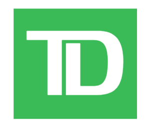
As a result, in 1969, the bank unveiled a new logo. The one that showcases them as a contemporary and well-known brand. This new TD green logo, otherwise known as “TD Shield”, was distinctive from its predecessors’ emblems.
It was minimal yet eye-catching with its vibrant green background. The typography consisted of the initial of Toronto-Dominion Bank in white, which bonded as one with no gap, signifying its merger. Underneath it, the word “bank” was showcased.
Hans Kleefeld, a designer at the Stewart & Morrison design firm, created this logo.
As time went on, the TD Bank logo underwent a few variations. These variations were done to represent the brand competently in new regions such as the United States.
2007 – Present: New TD Bank Emblem (United States)
In 2007, Toronto-Dominion Bank acquired Commerce Bancorp and merged it with its U.S. subsidiary, TD Banknorth. This new merger required a new identity, which is where this version of the TD bank logo comes from.

This version contains the familiar TD shield with the addition of the typography “Bank” to the right of it. The typography was in Green Pea gradient with a white backdrop. The font type for the lettering “bank” was customized sans-serif with some notes of Frutiger Ultrabold or Myriad Pro Bold.
The alternate version of this logo that you see below is almost similar, except with a sleeker display in the word composition and a longhand “a” in the lettering “bank”.
Another version of this US logo has a tagline of “America’s Most Convenient Bank” in a simple sans-serif font style.

This substitute version of the tagline-consisting logo also had a relatively thinner font style of the word “bank”.
2010 – Present: Another Minimalist Version
The bank first used this slightly updated TD Bank logo in its 2010 Annual Report. This new logo didn’t have the lettering “bank” beneath like the previous versions. Hence, it was simple and minimal at best. The same ligature TD typography with a slightly brighter neon-green gradient is a distinctive feature of this version.
As the TD Bank approached the year 2025, it ranked second in terms of assets, coming right after RBC Financial Group. Making its place under the “big five” banks of Canada, just like its luminary and noteworthy symbol.
Finally
The logo of Toronto-Dominion Bank is an immaculate example of the power of union, showing how strategic collaboration and shared vision ensure growth, stability, and long-term success.
When merged in 1955, the logo was deeply rooted in the Canadian culture and close to the core values of its predecessors.
As it grew and expanded beyond the country, it created a unique identity for itself with its 1969 logo. This new logo, despite having a modern style, still projects both banks’ strong merger, with its typical linked T and D inscription.
This logo is what binds the several operations of TD Bank and presents it as one entity.
FAQs
1. What does the logo TD stand for?
The TD in the TD Bank logo stands for Toronto-Dominion Bank, which is an acronym of two banks (The Bank of Toronto and The Dominion Bank) that merged to become the TD Bank.
2. What is the symbol for TD Bank?
The Toronto-Dominion Bank deals with businesses under the TD trademark. This inscription is encapsulated in a vibrant green backdrop. The trademark is also known as the “TD Green” or “TD Shield”.
3. What is TD Bank called in the USA?
The TD Bank is known as TD Bank, N.A. (National Association). It is an American subsidiary of Canadian TD Bank. Before its merger with Commerce Bank, the subsidiary was called TD Banknorth.
4. What is the history of TD Bank?
The TD Bank was established on February 1, 1955 when the Bank of Toronto (1855) and The Dominion Bank (1871) merged with a common perspective to enter the global banking market.