The article discusses the new EV logo by Audi for China as well as the history of Audi’s presence in China, among other details.
The Genesis of the New Audi Logo in China (November 2024 – Present)
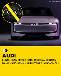
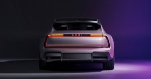
The famed four interlocking rings Audi logo has been replaced with a new “AUDI” wordmark in all caps for a new E concept electric sportsback in China. This shows Audi aims to kick start a new chapter in China instead of continuing with the past. This new logo represents the futuristic visual identity of Audi in China.
Also, since the logo redesign for electric-native brands moves away from traditional luxury marquees, Audi looks to position the E concept as a distinct sub-brand. The new wordmark logo breaks free from historical constraints and is optimised for the fast-moving EV ecosystem in China. This dual-brand approach enables Audi to continue with its heritage globally and experiment in China, where brand expectations and innovation cycles can change quickly.
The Elements of the New Audi Logo for the E Concept Models in China
Font
The new China-exclusive logo for the E concept sportsback model has been rendered in a minimalist, geometric sans-serif typeface to convey precision, clarity, and digital modernity. The letterforms in the wordmark are characterised by clean lines and wide letter spacing to represent high-tech aesthetics.
Colour
The wordmark logo by Audi for its E concept sportsback model in China is designed in illuminated white. This reinforces a clean, electric-native, and high-tech brand identity. Besides, the colour white displays high visibility and contrast, especially when pitted against darker backgrounds.
Finally
The launch of Audi’s new brand in China for the E concept models marks a decisive step in redefining the company’s future in its most important global market.
To know about the history and evolution of the traditional Audi logo, click here.