The article delves into the logo changes undertaken by the company since its inception, among other details.
The Genesis of the Kakao Corp. Logo (2006 – 2010)
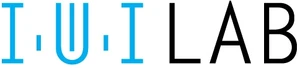
Kakao was previously known as iWILAB, the logo of which was text-based and in a combination of two colours, blue and black. Executed in all caps, the logotype had the first half (IWI) designed in blue, while the rest (LAB) appeared in black. The thin and elongated letterforms had generous spacing between them. The letter “W” was designed differently, that is, a big “U” punctuated by a short and thin vertical line in the middle. Besides, the letters “IWI” were separated by small dots, which looked more like thin strokes.
(2010 – 2014)
iWILAB was renamed Kakao in 2010, which necessitated a change in its logo. The new logo in a deep brown colour featured the brand name in a big, bold, and rounded sans-serif typeface.

(2014 – 2015)
In 2014, the company merged with Daum Communication and became Daum Kakao. The new logo featured the new brand name “daumkakao” in black lowercase and in a modern sans-serif typeface. Interestingly, the top ends of the vertical bars of “d” and “k” were cut at an angle.

(2015 – Present)
In 2015, the company was renamed Kakao Corp, and the new logo featured a standalone wordmark “kakao” in lowercase in both the yellow and black colour palettes.


The Elements of the Kakao Corp. Logo
Font
The wordmark in the Kakao Corporation logo is written in lowercase using a proprietary, custom and rounded sans-serif wordmark . The letterforms are characterised by generous spacing, uniform stroke widths, and soft curves.
Colour
The colour palette used to design the Kakao Corporation logotype comprises black and yellow.
Finally
The Kakao Corporation logo evolution shows how the company grew from a mobile startup to a mature and multi-platform technology conglomerate. The brand adopted a clean and lowercase wordmark with rounded letterforms to show continuity with Kakao’s approachable brand personality.