The article delves into the logo evolution, among other details.
The Genesis of the Rakuten Logo (1997 – 1999) (Unavailable)
The original Rakuten logo is not available in the public domain. However, it is argued that the logo was a text-based one to convey approachability and clarity. Initially, the company was called MDM, Inc.
(1999 – 2017)
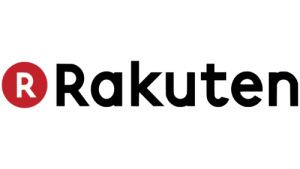
The earliest available Rakuten logo featured a red and white monogram or favicon and the brand name in black. The monogram had the letter “R” in white inside a small but solid red circle akin to the Japanese flag. Since the main business of the company is on the internet, the monogram looked like a button to be pressed.
Besides, the circle symbolised harmony, which in turn predicted the longevity of the company. To the right of the monogram appeared the first name of the company, “Rakuten”, in a black title case and in a rounded sans-serif typeface.
(2017 – 2018)
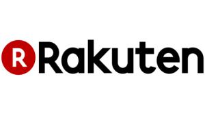
The 2017 logo iteration retained the earlier design, but both the “R” monogram in red and white and the wordmark in black were written using a clean, bold, and modern sans-serif typeface.
(2018 – Present)
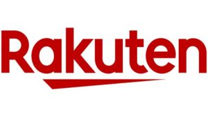
The latest logo contains only the wordmark and a short underline in red. The bright red colour of the logo symbolises growth and development, and the short triangular red underline with a thin and elongated right part reflects the progress made by the company. The brand name is rendered in a bold custom sans-serif typeface to evoke a sense of reliability.
The Elements of the Rakuten Logo
Font
The wordmark in the Rakuten logo is written using a bold and custom sans-serif typeface, aka Rakuten Sans, to convey a sense of protection and reliability. The typeface is similar to QARVIC Grunge Bold. The letterforms are clean and well balanced, and they create a sense of authority.
Colour
The logo is designed in a bright red colour to signify enthusiasm and expression. Besides, the red colour conveys the joys of life and reflects how the founder H. Mikitani created the company after the death of his relatives. It shows life is short and needs to be lived happily and brightly at present.
Finally
The Rakuten logo has been changed a few times to reflect the company’s transformation from a domestic online marketplace into a global technology-driven ecosystem. As Rakuten expanded into a multitude of areas, namely, fintech, digital content, and telecommunications, the logo too evolved to support a unified brand architecture.