NEC Corporation is a leading Japanese multinational technology company, which came into existence in 1899. It is known for its long-standing contributions to information technology, telecommunications, and digital solutions. It started its journey as Nippon Electric Company and was Japan’s first joint venture with foreign capital. Besides, the setting up of NEC Corporation marked the beginning of the country’s modern electronics industry.
NEC Corporation focuses on areas such as artificial intelligence, biometrics, cyber security, cloud computing, 5G networks, and social infrastructure solutions. Armed with expertise in such areas, the company serves governments, enterprises, and public institutions worldwide. It is guided by its corporate philosophy of “Orchestrating a brighter world” and aims to leverage technology to enhance safety, efficiency, and sustainability. It has become a key player in shaping the digital societies of the future.
The Genesis of the NEC Corporation Logo (1903 – 1928)
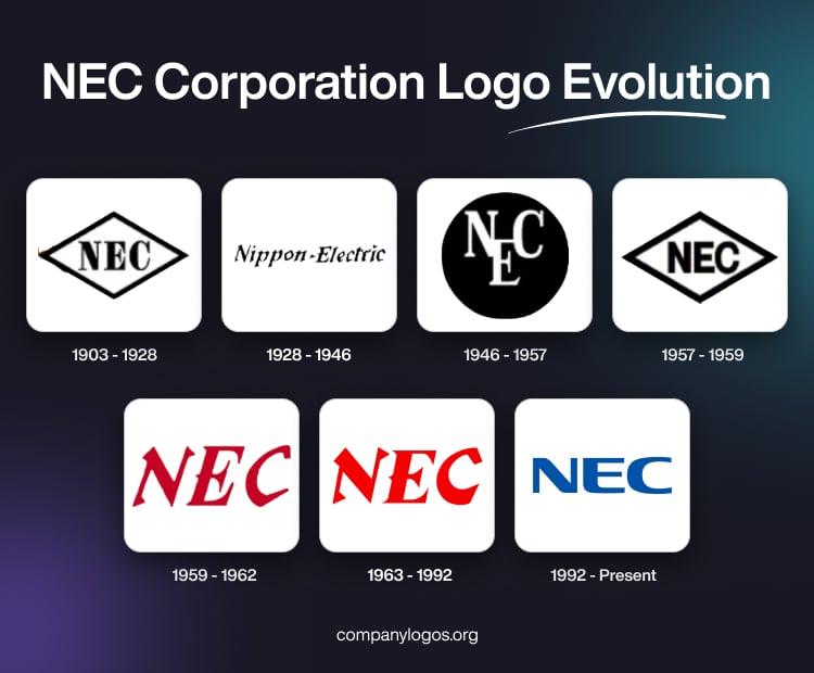
The first logo of NEC Corporation featured the abbreviation “NEC” in black inside a rhombus with black outlines. The lettering, which stood for the “Nippon Electric Company”, combined a mix of thick and thin glyphs with serifs.

(1928 – 1946)
The subsequent logo of 1928 showed the wordmarks “Nippon – Electric” in an italicised, stencil-like, stylish serif script. This minimalist logotype is featured in black against a white background.

(1946 – 1957)
The 1946 logo iteration brought back the abbreviated lettering “NEC” in white serifs and enclosed within a solid black circle. Here, the letter “E” appeared suspended between the letters “N” and “C”.

(1957 – 1959)
The logo of 1957 mirrored the original design of 1903 but in a thick and bold sans-serif typeface.

(1959 – 1962)
The serifs came back in the 1959 logotype in a red colour palette. The large slanted letterforms with pronounced serifs combined both thick and thin strokes.

(1963 – 1992)
The logo iteration of 1963 retained the previous lettering style in red and black against a white background. The letterforms had sharp design elements or serifs resembling thorns.


(1992 – Present)
Designed by Landor Associates in Japan, the current logo was introduced in 1992. The letterforms got rid of the sharp serifs and embraced partial rounding of corners. Besides, the square glyphs form a perfect harmony with the curves.

The Elements of the NEC Corporation Logo
Font
The abbreviated lettering “NEC” that forms the logo of NEC Corporation is written using a modern sans-serif typeface. The letterforms are characterised by rounded and sharp angles. The font is similar to Rogue Sans Nova, Xbka, and Vartek of Neuropa.
Colour
The lettering is written using an intense electric blue shade to convey the brand’s technological focus. Besides, the colour evokes a sense of professionalism and reliability.
Finally
The evolution of the NEC Corporation logo draws the growth arc of the company from a pioneering Japanese electronics manufacturer to a global technology and digital solutions leader. The logo changes undertaken by the company demonstrate a careful balance between heritage and innovation. Thus, while the design has been streamlined to suit the digital era, it has retained a strong sense of recognisability and corporate legacy as well.