Baidu is one of China’s most influential and innovative technology companies, which is best known for operating the country’s leading search engine and advancements in artificial intelligence. It was established in 2000 by Robin Li and Eric Xu and has since grown rapidly from a search-driven internet startup into a global technology powerhouse. Baidu boasts a diverse ecosystem of products, such as online search, cloud computing, digital maps, voice assistants, autonomous driving systems, and AI platforms.
It is often described as the “Google of China” and plays a central role in shaping China’s digital landscape. It serves billions of search queries daily and powers a vast range of consumer and enterprise technologies. It has positioned itself at the forefront of AI research and intelligent mobility.
Further, it continues to drive innovation through platforms like Baidu Brain, DuerOS, ERNIE, and Apollo. Furthermore, it continues to influence the future of smart, connected experiences across the world. The article explores the various logo changes undertaken by Baidu over the years, among other details.
The Genesis of the Baidu Logo (2000 – 2001)
The original Baidu logo featured the brand name integrated with a dog paw, thereby alluding to the excellent search capabilities of the animal. In fact, the dog paw print suggested that the user had chosen the right search strategy and was on the right path to reach the goal.
Set in vibrant red, the part “Bai” was written in a title case using a heavy geometric grotesque font. It was followed by a large-shaped dog paw print in blue with the part “du” in lowercase written across in white. Interestingly, the letters of the brand name were placed unevenly and not in a single line.

(2001 – 2002)
The first logo change in 2001 retained the design concept of the original logo but changed the font. The contours of all elements in the logo were made even and strengthened, which made the overall logo more distinct and balanced.
(2002 – 2005)
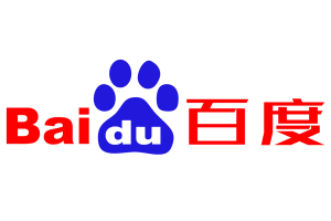
The 2002 logo iteration saw the addition of the brand name in the Chinese language to the right. As a result, the first part of the logo retained the previous design but in a lighter and brighter shade of red.
(2005 – 2020)
The 2005 logo variant saw the typeface of the brand name changed to a modern and futuristic one. The colour of the logo was also made darker and more intense. The logo evoked a sense of a serious and professional approach.
(2019/2020 – Present)
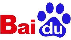
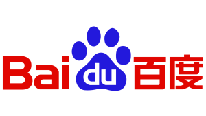
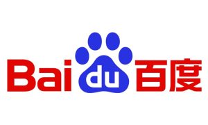
Designed by TsangerType, the current Baidu logo has a refreshed typography. The brand name was redrawn in a cleaner and more modern Encode Sans Wide Bold typeface. Besides, the paw and the letters of the brand name were made more balanced and visually consistent.
The Elements of the Baidu Logo
Font
The wordmark in the Baidu logo is written using a custom Encode Sans Wide Bold typeface. The letters of the wordmark are characterised by thick lines, softened angles, narrower contours, and straight cuts at the ends. The font is similar to Handel Gothic Bold or Snasm Regular.
Colour
The Baidu logo is designed using the colour combination of blue and red. Here, red is supposedly the most popular colour in China and adorns its national flag. White is used as a background colour.
Finally
The various iterations of the Baidu logo reflect the growth of the company from a rising search engine to a global leader in artificial intelligence and digital innovation. The consistent use of bold red and blue has strengthened brand recognition.
At the same time, the gradual design updates have aligned the logo with contemporary aesthetics and the company’s shift toward AI-driven services. The Baidu logo symbolises the maturity, stability, and forward-looking vision of the company. It encapsulates both its heritage in search and its expanding role in shaping the future of intelligent technology.