The article delves into the evolution of the Allen Edmonds logo, among other details.
The Genesis of the Allen Edmonds Logo (1922 – ????)
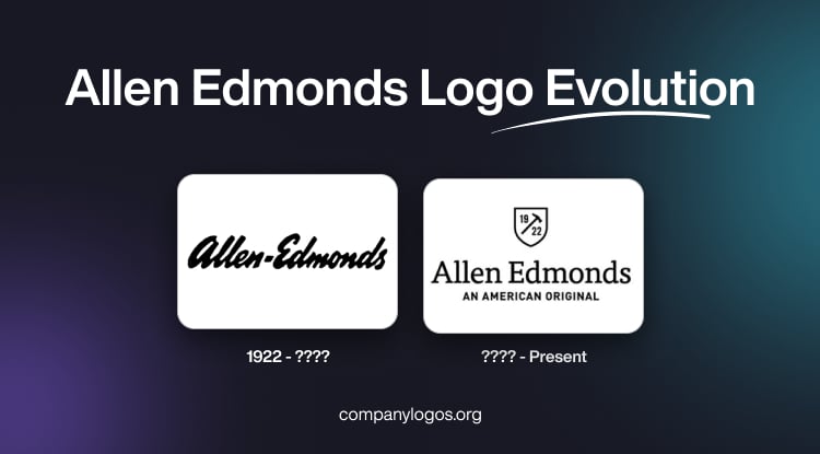
The original Allen Edmonds logo featured the brand name in black lowercase and written in a custom and stylish handwritten italicised typeface. The letterforms of the wordmark had narrowed contours. The black wordmark against a white background created a great visual contrast and increased readability.

(???? – Present)
As the world transitioned into the digital age, brands faced the challenge of adapting their visual identities to various online platforms. Allen Edmonds rose to the occasion by refining its logo for enhanced digital compatibility. The latest iteration of the Allen Edmonds logo features a shield emblem and the brand name in a custom, modern, and clean serif typeface.
The letters were characterised by bold lines and thin white spaces. The wordmark “Allen Edmonds” in a title case was followed underneath by the tagline “AN AMERICAN ORIGINAL” in an uppercase sans-serif typeface. The shield emblem had the number “1922” separated by a hammer sign.

The Elements of the Allen Edmonds Logo
Font
The present Allen Edmonds logo relies entirely on text. It features a custom serif typeface characterised by bold lines and delicate white spaces within the letters. This design choice imparts an open, lightweight, and modern aesthetic.
Colour
The logo maintains an elegant and timeless black-and-white colour scheme, which has consistently served as the brand’s primary palette.
Finally
The evolution of the Allen Edmonds logo tells a compelling story of a brand that has gracefully navigated the currents of time.