In the article, we discuss the journey of the logo through the years, among other details about the brand.
The Genesis of the Alpha Industries Logo (1980 – 1992)
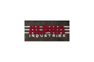
The original Alpha Industries logo featured the brand name in two levels within an olive drab rectangular background. The word “ALPHA” in uppercase featured at the centre and was written using a simple sans-serif typeface. The block letters of the wordmark had closed spaces. The word “INDUSTRIES” in white uppercase appeared below in a smaller size. The word “ALPHA” was placed against three parallel horizontal lines in white.
(1992 – Present)
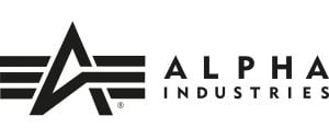
The 1992 logo underwent another revision, with the typography modernised. This gave the overall design a cleaner and more sophisticated look. Here, the graphical emblem featured the letter “A” in black positioned in the foreground of the iconic three-line bar in white. In fact, the letter “A” was seamlessly integrated with the bars in the Alpha Industries logo. The decision to adopt this straightforward design was influenced, in part, by the need to accommodate the brand’s internationalisation of sales. To the right of the emblem is written the brand name in two levels. Written in a clean and modern sans-serif typeface, the letterforms of the wordmark have lots of space between them.
The Elements of the Alpha Industries Logo
Font
The Alpha Industries logotype uses a bold and geometric sans-serif typeface to convey precision, strength, and military legacy. The block-like letterforms of the wordmark are characterised by clean cuts, even weighting, and thick strokes. The typeface has similarities with Eurostile, Bank Gothic, or Microgamma.
Colour
The Alpha Industries logo uses the black, white, and olive green colours for specific use. Here, the black colour conveys technical precision, power, and seriousness. The white colour is used for contrast, while the military or olive green colour is used to reflect the brand’s legacy in designing military apparel.
Finally
The evolution of the Alpha Industries logo encapsulates the brand’s journey from a military supplier to a global fashion phenomenon. The logo’s transformation reflects the dynamic nature of the fashion industry and the brand’s ability to adapt while staying true to its roots.