Mindtree, or LTIMindtree, is a well-known information technology consulting and digital transformation company that specialises in helping enterprises navigate and succeed in the evolving digital landscape. Based in Bangalore, India, Mindtree was founded in 1999. The company delivers services in areas such as cloud computing, data analytics, artificial intelligence, enterprise IT modernisation, and customer experience.
Over the years, Mindtree has earned a reputation for its client-centric approach, innovative culture, and strong engineering capabilities. It serves industries such as banking and financial services, retail, travel, manufacturing, communications, and technology. As part of the LTIMindtree brand under the Larsen & Toubro Group, it continues to enable businesses worldwide to accelerate digital adoption and achieve scalable, future-ready solutions.
The article delves into the evolution of the Mindtree logo, among other details. Interestingly, the first logo of Mindtree was designed by a physically challenged child in Karnataka, India.
The Genesis of the Mindtree or LTIMindtree Logo (1999 – 2012)
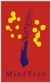
The original Mindtree logo was hand-drawn, and it conveyed values that were embodied by the company. It featured a warm and creative human-centric design by an alumnus of the Spastic Society of Karnataka. The logo contained a red square background with abstract elements, which included an upward brush stroke in blue and a pattern of circular yellow dots.
The blue brushstroke signified aspiration, imagination, and forward motion. The yellow dots represented innovation, energy, and curiosity. The red background conveyed confidence, warmth, and passion, qualities that aligned with the company’s vision of empathy-led technology. The company name “Mind Tree” was written in blue below the brushstroke in a title case.
(2012 – 2022)
The second logo iteration in 2012 was designed by Siegel and Gale, and it featured a pink and white coloured circular emblem containing slanted intertwined lines. The emblem resembled a tree canopy or a network of connected threads. The design of the emblem conveyed interconnectedness, collaboration, and diversity of thought.
The wordmark accompanying the emblem “Mindtree” was written using a clean and minimalist sans-serif Chevin typeface in monochrome. Beneath the wordmark was written the tagline “Welcome to Possible” to convey the forward-thinking philosophy and confidence of the company in helping clients and their customers achieve the seemingly challenging or futuristic. In another logo iteration, the tagline “A Larsen & Toubro Group Company” appeared below the logo elements described above.


(2022 – 2026)
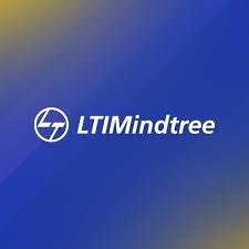
The logo was necessitated after the merger of Mindtree and L&T Infotech. It thus represents the birth of a combined entity under a single brand. The minimalist logotype featured the wordmark “LTIMindtree” in a clean and modern sans-serif typeface. The unified brand name signifies unity, synergy, and a common corporation vision. To the left of the wordmark appears the “L&T” logo containing the letters “L” and “T” placed one below the other, but inside a white circle.
(2026)
After the 2022 merger, the remodelling of the brand’s name from LTIMindtree to LTM Limited is its first major transformation. The board of directors revealed this rebrand on 11th February 2026 with a fresh tagline- “It’s time to Outcreate.”
CEO Venu Lambu stresses the fact that this corporate change will showcase the company’s growth post-acquisition.
The new LTM logo consists of the initials ‘LTM’ in bold, all-caps, sans-serif font. The letters are presented in a smooth, matte-looking red hue.
The Elements of the Mindtree or LTIMindtree Logo
Font
The wordmark in the Mindtree logo is executed using a simple, clean, geometric, and modern sans-serif typeface to convey clarity, professionalism, and a modern outlook. The letters of the wordmark are characterised by even strokes and geometric proportions.
Colour
The LTIMindtree logo is designed using a deep blue and white colour palette, where white serves as a background.