Dassault Systèmes is a leading global software company based in Vélizy-Villacoublay, France. It is known for pioneering 3D design, engineering, and product lifecycle management (PLM) solutions. The company was founded in 1981 as a spin-off of Dassault Aviation, and the company initially focused on developing advanced 3D modelling software to support the aerospace industry. Over time, Dassault Systèmes expanded its scope to serve multiple sectors.
These included automotive, industrial equipment, architecture, life sciences, consumer goods, and high technology. The logo evolution shows how the company transformed itself into a forward-driven company. Although the timelines of the various logo changes undertaken by the company are not documented, the article explores the three logos, among other details, of the company.
The Genesis of the Dassault Systèmes Logo (1981 – 2000s)
The first Dassault Systemes logo represented the launch of a 3D design tool called 3D, interactive CATIA. It featured three nested squares in monochrome of varying sizes. The outer end of the square forms an abstract geometric figure of three triangles in solid black with pointed ends in the foreground.

(2000s)
The subsequent logo was designed somewhere in the 2000s, and it featured three abstract triangles in shades of blue with a gradient converging at the centre to convey a 3D effect. It was followed by the brand name in slanted uppercase and written using a sans-serif typeface in deep blue.
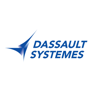
(200? – Present)
The latest Dassault Systemes logo features a combination of a graphic emblem and a wordmark. The 3DS symbol in blue appears to be the styled company name, while the wordmark, also in blue, is written using a clean, custom, and modern sans-serif typeface. Here, the 3D and S shapes of the emblem symbolise movement, creativity, and multidimensional thinking.

The Elements of the Dassault Systèmes Logo
Font
The wordmark forming the Dassault Systèmes logo is written using a custom and modern sans-serif typeface to convey professionalism, clarity, and technological sophistication. The letters are characterised by rounded and smooth curves.
Colour
The Dassault Systèmes logo is designed using deep blue as its colour palette to symbolise trust and reliability. Besides, blue conveys intelligence, innovation, and precision, qualities that are essential to the identity of Dassault Systèmes.
Finally
The Dassault Systèmes logo shows the journey of the company from a specialised engineering software provider to a global leader in virtual experience technology. The early logo variant emphasised precision and technical sophistication. It showed its origins in aerospace design and advanced CAD solutions like CATIA.
The current logo, featuring the distinctive 3DS emblem, represents both continuity and vision. The “3D” and “S” shapes form a dynamic mark that signifies movement, creativity, and multidimensional thinking. The logo reinforces the brand identity of Dassault Systèmes as a forward-thinking, human-centric, and technology-driven company.