In the realm of outdoor apparel and gear, few brands command as much respect and admiration as ARC’TERYX. It is renowned for its commitment to innovation, quality, and performance and has become synonymous with excellence in the outdoor industry. Founded in 1989, this Canadian company focuses on crafting high-quality clothing and equipment tailored for mountain sports and track racing.
The company’s name and logo draw inspiration from Archaeopteryx, which is a prehistoric genus of bird-like dinosaurs. At the heart of this iconic brand lies its distinctive logo. It is a symbol that has remained consistent over the years and reflects the company’s journey, values, and unwavering pursuit of perfection. The article explores the logo of the company, among other details.
The Genesis of the ARC’TERYX Logo (1991 – Present)
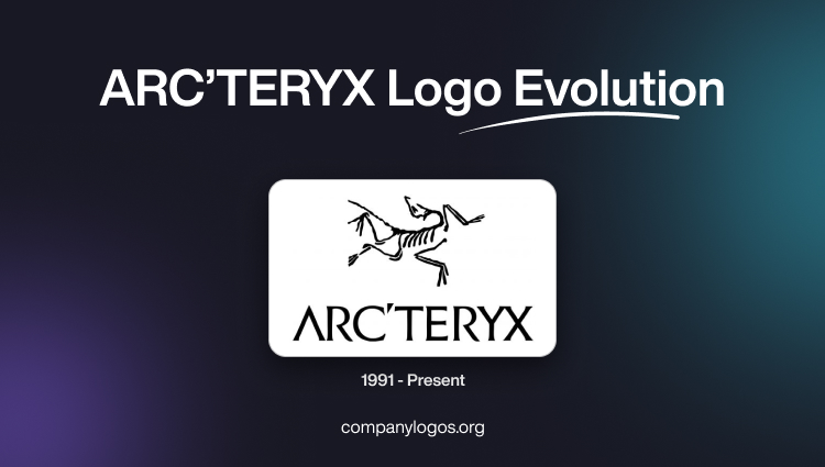
Although the company began its journey as Rock Solid, there is no documented logo for the same. In fact, the logo appeared when the company changed its brand name to ARC’TERYX in 1991 and has remained so to date. The logo comprises a graphical part and a wordmark placed underneath. Represented in black against a white background, the graphical part features a stylised depiction of the Archaeopteryx, an ancient bird-like dinosaur.
This vertebrate animal bird had its wings formed to adapt to the hostile prehistoric conditions when dinosaurs roamed the earth. This reptile bird played a crucial role in the history of evolution and represents the transition from reptiles to birds. So, the graphical part of the logo shows a stylised skeleton of Archaeopteryx in thin black lines to evoke a sense of mystery and antiquity.
The brand name underneath the emblem is executed using a medium-weight custom typeface having sharp ends. The black and white colours of the logo reflect key attributes of the brand. For instance, black represents strength, stability, and reliability, while white stands for purity and clarity.

The Elements of the ARC’TERYX Logo
Font
The wordmark used in the Arc’teryx logo is featured in uppercase and is written using a custom typeface. The letters of the wordmark are characterised by clean, medium-weight letters with small, sharp serifs at the ends of the bars. This lettering exudes elegance, and each letter displays a sense of stability and self-sufficiency. The bespoke font of the Arc’teryx logotype bears resemblance to ITC Elan, with certain details reminiscent of Liste Normal fonts.
Colour
The colour palette of this Canadian outerwear fashion brand exclusively employs black lines for all elements. This commitment to black has kept the Arc’teryx logo unchanged since 1991. In fact, the colour black is synonymous with style and elegance and signifies the professionalism and expertise of the company. The background colour of the logo is chosen as white for better visual contrast, purity, and clarity.
Finally
The ARC’TERYX logo has remained consistent since its founding in 1989. It shows how the brand has transitioned from a niche innovator to a global leader in outdoor apparel and gear. The accompanying graphical symbol, Archaeopteryx, once a symbol of adaptation and evolution, has been transformed into a sleek, modern emblem. It embodies the brand’s commitment to excellence. The overall logo successfully blends deep symbolism, historical context, and modern design trends.