The Sage Group, aka Sage, is a leading British multinational software company based in Newcastle upon Tyne, England. It was founded in 1981 by David Goldman, along with Paul Muller and Graham Wylie. The company has since grown into one of the world’s largest providers of business management software. It serves millions of small and medium-sized enterprises across more than 20 countries.
The company is widely recognised for its accounting, payroll, human resources, and enterprise resource planning (ERP) solutions, which help businesses streamline their financial and operational processes. Over the decades, Sage has built a strong reputation for reliability, user-friendly systems, and continuous innovation. It remains a key technology partner for businesses globally, and it empowers organisations to increase productivity, maintain compliance, and accelerate growth. The article explores the various logo changes undertaken by the company over the years, among other details.
The Genesis of the Sage Group Logo (1981 – 1989)
The original Sage logo featured a plain wordmark “SAGESOFT” in green uppercase and written in a serif typeface. The letters sporting thin and thick widths were readable and functional. The serif typeface focused on clarity rather than on style and reflected the modest roots of the company.

(1989 – 1996)
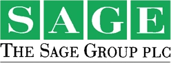
The 1989 logo variant was introduced alongside the launching of the company on the stock exchange. Here, the individual letters of the wordmark “SAGE” in white were placed in tiny green square blocks. The basic letterforms written in a serif style were the same as the earlier variant, and they conveyed a more professional feel. The wordmark was followed below by the complete name of the company in black uppercase.
(1996 – 2015)
The 1996 logo version had the wordmark “sage” written in a dark green colour palette against a white background and in a typeface derived from the DIN family. It had very tight spacing between the vertically compressed letters in a clean DIN-derived sans-serif style. In fact, the letters seemed to have merged into each other.

(2015 – 2022)
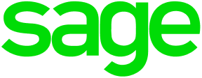
The 2015 logo variant continued with the same DIN-derived sans-serif style of typeface. However, the spacing between individual letters was relaxed compared to the earlier one. In fact, the wordmark in a light green colour palette got a more open, less compressed, and modern feel.
(2022 – Present)
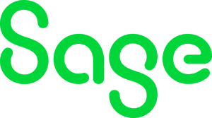
The present logo is designed by Jeremy Mickel for the Wolff Olins design consultancy. The logo uses a more fluid and rounded wordmark in a title case and evokes simplicity, confidence, and flow. The colour palette of the logo has been retained as green, or rather “sage green”, which became strongly associated with the company. The “sage green” colour palette symbolises stability, growth, calmness, and trust.
The Elements of the Sage Group Logo
Font
The Sage Group logo wordmark is written using a clean and modern sans-serif typeface to reflect clarity and professionalism.
Colour
The Sage Group logo is designed using a green colour palette, aka “sage green”. The colour evokes a sense of stability, growth, calmness, and trust.
Finally
The Sage Group logo and its various changes over the years show how the company transformed itself from a regional software startup to a global leader in business technology. Each logo redesign showed shifts in technology trends, business strategy, and brand identity. Its clean and contemporary green wordmark in recent years highlights the company’s focus on innovation, cloud solutions, and empowering small and medium-sized businesses with intuitive digital tools.