Sopra Steria is a leading information technology and consulting company that provides digital transformation services to businesses and governments. Based in France, the company helps organisations improve the way they work through technology, innovation, and smart digital solutions. Sopra Steria offers a plethora of technological services such as cloud computing, cyber security, software development, artificial intelligence, and IT consulting.
The combined entity Sopra Steria was formed after the merger of Sopra and Steria in 2014. Its logo has undergone just one change in 2024, wherein the previous logo elements have been retained but refined. The article explores the logo evolution of Sopra Steria, among other details, of the company.
Since the Sopra Steria Company is a result of the merger of two companies – Sopra and Steria – their individual logos existed prior to the merger.
Sopra (1968 – 2014)
The Sopra logo consisted of a wordmark and a graphical emblem. The wordmark depicted the brand name “sopra” in a clean and bold sans-serif font in lowercase. The graphical emblem in red to the left of the wordmark featured a small stylised symbol and its mirror image below.
Steria (1969 – 2014)
The Steria logo also depicted a graphical emblem and a wordmark. The emblem featured dynamic arcs or branches and leaves in orange and red, and its circular flow symbolised integration, collaboration, and the idea of bringing people together. The wordmark to the right of the emblem was written in lowercase using a clean and rounded sans-serif typeface.

The Genesis of the Sopra Steria Logo (2014 – 2024)
The first Sopra Steria logo after the merger of the Sopra and Steria companies featured a wordmark and a graphical emblem. The wordmark was written in black using a clean, modern, and rounded sans-serif typeface. The lowercase letters conveyed approachability and unity. The graphical emblem comprising an interlocking symbol was placed between the two words. The emblem was similar to the Sopra symbol in red and orange but considerably refined.

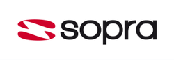
(2024 – Present)
In 2024, Sopra Steria introduced a new visual identity to emphasise ONE company. Although it looked similar to the previous iteration with respect to the symbol, style, wordmark, and colour identity, the proportions, spacing, and geometry have undergone subtle changes. For instance, the interlocking orange-red symbol has become flatter, and the colours have got minimal gradient and slightly softer tones, while the letters of the wordmark have got slightly refined spacing.

The Elements of the Sopra Steria Logo
Font
The wordmark in the Sopra Steria logo is written in lowercase using a clean, simple, modern, and rounded sans-serif typeface. The typeface conveys approachability and friendliness.
Colour
The Sopra Steria wordmark is written using a dark grey or black colour to symbolise trust, stability, and strength. The graphical emblem is designed using bright orange and red shades with a gradient. The warm colours represent innovation, creativity, energy, and digital transformation.
Finally
The evolution of the Sopra Steria logo reflects the journey of the company from two separate technology firms to a unified global digital leader. Each change in the logo represents growth and modernisation. Besides, it blends Sopra’s software expertise with Steria’s strong IT service background. The bold yet friendly design of the logo symbolises innovation, digital transformation, and a forward-thinking approach.