Red Hat is a leading American enterprise software company known for its open-source technology and transforming it into reliable, secure, and scalable solutions for businesses worldwide. Based in Raleigh, North Carolina, the company traces its roots to 1993 and began operating as an independent company from 1995.
The company is best known for Red Hat Enterprise Linux (RHEL), a highly stable and enterprise-grade operating system that is widely used across data centres, cloud infrastructure, and mission-critical environments. Over the decades, Red Hat expanded its portfolio beyond Linux and started offering a slew of products and services in several domains. These included cloud computing, automation, middleware, storage, virtualisation, and Kubernetes-powered container platforms.
In 2019, Red Hat became part of IBM through one of the largest technology acquisitions in history. However, it continues to operate independently under its own brand and open-source principles. It remains a global symbol of innovation, community collaboration, and the power of open-source software to drive digital transformation. The article explores the various logo changes undertaken by Red Hat over the years, among many other details.
The Genesis of the Red Hat Logo (1993 – 1995) (Unavailable)
The forerunner of Red Hat Inc. was ACC Corporation, founded by an entrepreneur, Bob Young, in 1993. However, in 1995, the company merged with Marc Ewing’s Red Hat Linux Distribution business to form Red Hat Software. There is no documented information about the logo of ACC Corporation.
(1995 – 1996)
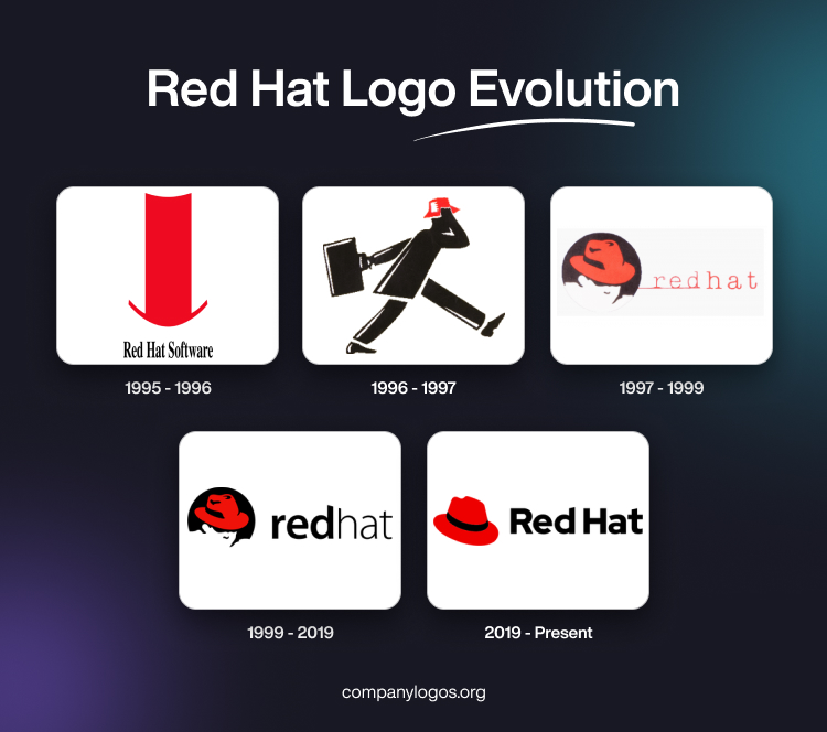
The combined entity, Red Hat Software, was founded in 1995. Its first logo featured a bright red brimmed top hat stretched vertically. Below the hat emblem was written the company name “Red Hat Software” in a modified thin compressed Nimbus Roman No. 9L font in black.

(1996 – 1997)
The logo was changed in 1996, wherein it featured the silhouette of a Black man with a small suitcase wearing a red hat taking long strides. There were white accents on the black silhouette as well as on the red hat.

(1997 – 1999)
The logo of 1997 featured a black circle containing the silhouette of a man’s face in white wearing a red hat and adorned with a black ribbon. To the right of the emblem was written the company name using a thin American Typewriter typeface in red. Interestingly, the word “red” was underscored by a thin red line, while the word “hat” appeared in a slightly bigger size without any line underneath.

(1999 – 2019)
In 1999, the previous logo iteration was modified, wherein the background colour was turned scarlet red, while the wordmarks “redhat” and “LINUX” in black were placed to the right of the emblem in two levels. In the wordmarks the words “red” and “LINUX” were written in a bold Myriad typeface. The “LINUX” wordmark in a smaller size had adequate spacing between letters.

(2019 – Present)
In 2019, the company was acquired by IBM, which necessitated a logo change. Designed by Pentagram, the logo consists of a graphical emblem and the wordmark “Red Hat” in a title case. Here, the graphical emblem constitutes a classic fedora hat in red adorned with a black ribbon. The wordmark in black, on the other hand, is rendered using a Red Hat Display typeface where the top ends of the individual letters “d” and “t” have diagonal cuts.

The Elements of the Red Hat Logo
Font
The wordmark that forms a part of the Red Hat logo is written in black using a custom Red Hat Display typeface, and the top ends of the letters “d” and “t” have diagonal cuts.
Colour
The Red Hat emblem is designed using a combination of a red and black colour palette. The wordmark is written in black as well.
Finally
The Red Hat logo and its various iterations are a testament to the company’s commitment to open-source principles and its ability to adapt while staying true to its roots. They reflect how the company grew from a scrappy open-source startup to a global leader in enterprise software. The latest logo is a bold and minimalist red fedora, which is designed to be more versatile, modern, and universally recognisable.