Workday, Inc. is an American cloud-based enterprise software company known for providing innovative solutions in a host of domains. These include Human Capital Management (HCM), financial management, planning, and analytics. The company was established in 2005 by former PeopleSoft executives Dave Duffield and Aneel Bhusri. Workday emerged with the vision of simplifying and modernising enterprise applications through cloud technology. Consequently, the company quickly gained traction for its intuitive user experience, scalability, and continuous innovation model. It offered businesses a flexible alternative to traditional on-premise systems.
Workday serves a diverse range of industries, which includes technology, education, government, healthcare, and finance. It helps organisations streamline processes, improve decision-making, and adapt to evolving workforce and financial needs. It focuses on artificial intelligence, machine learning, and real-time insights and continues to be recognised as a leader in cloud enterprise solutions worldwide. The article delves into the evolution of the Workday logo, among other details of the company.
The Genesis of the Workday Logo (2005 – 2024)
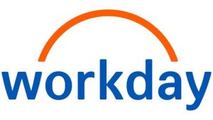
The original Workday logo comprises a wordmark in blue and an arc in orange. The arc connects the letters “o” and “a” to convey an invisible support for the word. The arc was akin to the rising sun and symbolised the onset of a new day, opportunities, and energy. In fact, the logo encapsulated the meaning of every working day, the one that begins with the rising sun, new goals, and objectives. The arc deftly establishes a connection between technological solutions and unites people and processes.
Beneath the orange arc of medium thickness, the brand name is mentioned in lowercase using a grotesque typeface with no serifs. The space between characters is quite wide. The wordmark is written using blue, which is associated with reliability and professionalism. On the other hand, the colour orange is associated with energy and positivity.
(2024 – Present)
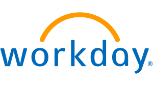
The logo was revised by Koto in 2024, wherein it received a fresh look. If the earlier arch appears like a disjointed element, separate from the wordmark, the one here comes out of the letter “W”. Although the arch continued to symbolise sunrise, its shape is rather soft and more natural. Besides, it looked like an organic part of the logo.
The wordmark appears modern and cleaner and is written using the Workday Sans typeface. The letters of the wordmark are characterised by less space compared to the previous logo, strict geometry, and smooth lines. The orange colour of the arc has been made brighter, and the new logo iteration conveys a warmer visual language.
The Elements of the Workday Logo
Font
The wordmark used in the Workday logo uses the Workday Sans typeface, which is easy to read, clean, and modern and is adaptable to any platform, especially digital and print.
Colour
The colour palette to draw the Workday logo includes a dark blue shade and orange, set against a neutral white background. The blue colour of the wordmark symbolises professionalism and reliability, while the orange colour of the arc symbolises friendliness and energy.
Finally
The Workday logo has changed only once after its introduction in 2005. The logo reflects the company’s journey from a disruptive startup to a trusted global leader in enterprise cloud solutions. The logo’s core design elements, especially its bright arc symbol, have remained consistent. They represent optimism, growth, and the rising potential of people and organisations.
So, like the evolution of Workday itself, the brand identity demonstrates a balance of stability and forward-thinking progress. It reinforces the company’s role in reshaping the future of work through intelligent, cloud-driven enterprise systems.