Hewlett Packard Enterprise, or HPE, is a global technology company that delivers innovative solutions to help organisations accelerate their pace of digital transformation. It was formed in 2015 after the historic split of the original Hewlett-Packard Company. HPE focuses on enterprise-level products and services, which include servers, storage, networking, hybrid cloud platforms, high-performance computing, and edge-to-cloud technologies.
The company’s mission is to unlock value from data and empower businesses to move faster. It possesses deep industry expertise and cutting-edge innovation. Its portfolio spans HPE GreenLake, Aruba Networking, and advanced AI and computer systems. These ensure the company is known as a trusted partner for enterprises that seek agility, efficiency, and secure, scalable infrastructure in an increasingly connected world. The HPE logo has changed only once since its founding in 2015. The article explores the logo evolution of HPE and chronicles its eventful journey over the years, among other details.
The Genesis of the Hewlett Packard Enterprise Logo (2015 – 2025)
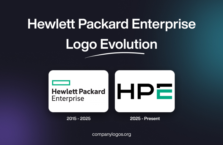
The original Hewlett Packard Enterprise (HPE) logo consists of a graphic emblem as well as a text component. The text in black is further divided into two parts, where the top line shows the name “Hewlett Packard” in a bold geometric typeface. The bottom line, on the other hand, shows the word “Enterprise” in a thin typeface. The left-aligned text created a sense of stability.
The graphical element featured a rectangle in a thick bright green border placed above the text. Here, the colour green represented innovation and growth, while the rectangular shape of the emblem symbolised development, openness, and progress. The brand name reflected the legacy of the company, while the word “Enterprise” showed the company’s focus on large businesses.

(2025 – Present)
A brand new logo has been designed to celebrate the 10th anniversary of the company. The logo consists of the “HPE” initials written using a bold, geometric, and uppercase sans-serif typeface. The logotype conveys a clean, modern, and confident appearance. Interestingly, the letter “E” has a distinctive style, with its middle and bottom bars rendered in a solid green colour.
The disjointed top bar, on the other hand, appears in black. In fact, both “H” and “P” are rendered in black. The colour combination of green and black ties the latest logo to the graphical emblem of the original logo. The cleaner and sharper logo embodies simplicity, assuredness, and sophistication. The new logo conveys a bold expression of the company’s purpose, its people, and the impact it seeks to make.

The Elements of the Hewlett Packard Enterprise or HPE Logo
Font
The HPE initials that form the logo are written using a modern, geometric, clean, bold, and all-caps sans-serif typeface. The letter “E” has a distinct shape – the middle and bottom portions are rendered in a green hue, while the top is displayed in black. The typography symbolises strength, clarity, and confidence and aligns with HPE’s positioning as a major player in hybrid cloud, AI, and enterprise infrastructure.
Colour
The HPE logotype uses a bright shade of green, especially for the middle and bottom parts of the letter “E”, and black for the rest of the letterforms. This colour palette reinforces a modern brand identity.
Finally
The HPE logo shows a change in design as well as a deeper transformation in the purpose and positioning of the company. The twin logos designed by the company symbolise agility, continuity, and growth. The logo captures the rich legacy of HPE and focuses on its future vision. It is a powerful emblem for a company that continues to innovate and scale in a fast-changing technological landscape.