boAt is a leading Indian consumer electronics brand known for its stylish and affordable audio products. These include headphones, earphones, speakers, and smart wearables. The company was founded in 2016 by Aman Gupta and Sameer Mehta, and it quickly rose to prominence by blending cutting-edge technology with trendy, youth-centric designs. In fact, the brand has become synonymous with a modern lifestyle, and it targets millennials and Gen Z consumers who seek both performance and fashion in their gadgets.
Thanks to its vibrant product lineup and bold marketing approach, boAt has successfully positioned itself as a “Made for India” brand that resonates with music lovers and tech enthusiasts alike. It focuses on durability, affordability, and design innovation, qualities that have made it one of the fastest-growing audio brands not just in India, but globally. The article delves into the evolution of the boAt logo, among other details about the brand.
The Genesis of the boAt Logo (2016 – Present)
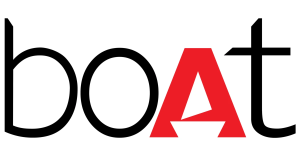
The boAt logo features the brand name in a mix of uppercase and lowercase letters. It is also a stylised representation of the boat where the letter “b” forms the mast and sail of the boat. The capital letter “A” in red colour is shaped like a sail to convey the imagery of a boat, and it symbolises motion and adventure, similar to a sailing boat.
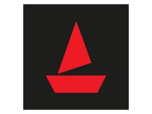
The letters “boAt” are executed in a modern sans-serif font to reflect a contemporary style. Besides, the lowercase letters “b”, “o”, and “t” in black offer a friendly identity. The colour combination of black and red creates a contrast and makes the logo look visually appealing. In addition to the logotype, there is also a sailboat motif in red, which is often embossed on products. It comprises an upside down trapezium below and an angular vertical triangle above.
The Elements of the boAt Logo
Font
The brand name featured in the boAt logo is written using a modern and clean sans-serif typeface. The lowercase lettering conveys a friendly and approachable identity and resonates with its youthful target audience. The letter “A” in the logo has a triangular sail attached to it to symbolise adventure, motion, and the spirit of exploration.
Colour
The boAt logo uses a combination of black and red colours. Here, black symbolises sophistication, strength, and reliability, while red is associated with passion, boldness, and energy.
Finally
The evolution of theboAt logo shows how the brand grew from a bold startup to a leading lifestyle and audio powerhouse. Its logo has retained its clean and modern aesthetic while adapting to digital and global platforms. This steady evolution of the logo reflects boAt’s growth philosophy of staying true to its Indian roots while sailing forward with global ambitions.