Bitstamp is one of the world’s longest-running and most trusted cryptocurrency exchanges. It was founded in 2011 by Nejc Kodric and Damijan Merlak in Slovenia and is known for its reliability, transparency, and regulatory compliance. Bitstamp was created as a European alternative to the then-dominant Mt. Gox exchange. Over the years, it has grown into a global platform that allows users to buy, sell, and trade a variety of digital assets, which include Bitcoin, Ethereum, and other major cryptocurrencies.
Based in Luxembourg, Bitstamp operates under strict financial regulations and was among the first crypto exchanges to be licensed under the EU’s Payment Institutions framework. It focuses on security, customer service, and institutional-grade infrastructure and has earned a strong reputation among both retail and professional traders.
As a cryptocurrency company, Bitstamp continues to play a key role in bridging traditional finance and the emerging digital asset economy. The logo of Bitstamp has evolved since its founding and reflects the company’s journey to becoming a global platform for trading digital assets. The article explores the logo evolution of Bitstamp, among other details of the company.
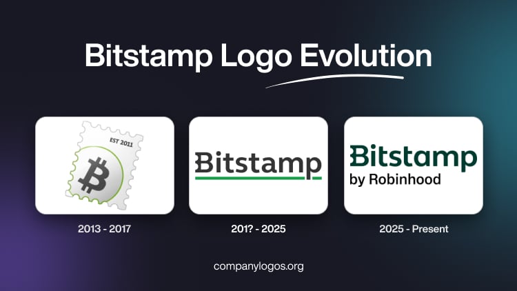
The Genesis of the Bitstamp Logo (2013 – 2017)
The original Bitstamp logo featured the letter “B” with two elongated thin vertical bars at the top and bottom to symbolise the bitcoin digital currency. Designed in grey, the motif was shown against a white and light grey background with a gradient.

(201? – 2025)
The logo during this period featured the brand name “Bitstamp” in a modern, bold, sans-serif typeface. The use of a dark colour palette conveys professionalism and seriousness, qualities important for a financial or crypto brand. The wordmark had a vivid green underline, which gave a visual anchor to the logo and added a sense of vibrancy, optimism, stability, and growth.

(2025 – Present)
After Bitstamp was acquired by Robinhood Markets Inc. on 2nd June 2025, the company underwent a branding transition to align with the new development. The redesigned logo featured the brand name “Bitstamp” in dark green and was followed by the tagline “by Robinhood” in black below.

The Elements of the Bitstamp Logo
Font
The wordmark in the Bitstamp logo is written using a clean, bold, and modern sans-serif typeface where the letterforms are characterised by softer curves and consistent stroke widths. The letter “B” in uppercase features geometric precision and balanced curves, especially along its vertical bar. The tagline “by Robinhood” in black is also written in a sans-serif typeface, albeit in a smaller size.
Colour
The logo is designed using a dark green and black colour palette. Here, “Bitstamp” is featured in a dark green colour palette, while “by Robinson” appeared in black.
Finally
The evolution of the Bitstamp logo shows how the company grew from a small European Bitcoin exchange into a globally trusted financial technology brand. Each logo redesign has symbolised a new chapter in its journey. Thus, if in the initial years, the logo had a minimalist identity that represented simplicity and innovation, the latest design conveys maturity, security, and credibility.