Safari is the official web browser of Apple and is designed to offer a fast, secure, and energy-efficient way to explore the internet across all Apple devices. It was introduced in 2003 and soon became a core part of Apple’s ecosystem. It replaced Internet Explorer as the default browser on macOS. The browser is built on the powerful WebKit engine, which enables it to deliver smooth performance and strong privacy protection. It also allows deep integration with Apple services such as iCloud Keychain, Handoff, and Apple Pay.
Safari is the default browser for macOS, iOS, iPadOS, and visionOS. It is a symbol of Apple’s commitment to user privacy, speed, and energy efficiency. With modern features like Intelligent Tracking Prevention, Reader Mode, and Passkeys, Safari continues to redefine the browsing experience. It blends cutting-edge web technology with Apple’s signature minimalist design philosophy. The article discusses the evolution of the Apple logo, among other details.
macOS
The Genesis of the Safari (macOS) Logo (2003 – 2014)
The design of the initial Safari logo for macOS featured a three-dimensional image of a compass. Designed using a thick silver-metal frame, the compass depicted a glossy surface and was placed a tad diagonally. Although the compass was tilted to the left, its needle was pointing to the right.

(2014 – 2020)
The 2014 logo iteration featured a compass roundel with a thin silver frame, a blue dial with a gradient, and tiny white markings. It contained a three-dimensional silver and red compass needle tilted to the right.

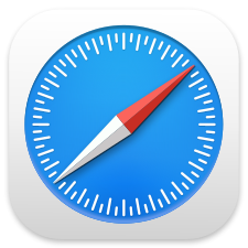
(2020 – 2025)
The logo of 2020 depicted the blue roundel enclosed within a light grey-white square with round corners. The needle in silver and red colours is shown a little thinner than the previous logo. The gradient blue in the background turned blue.
(2025 – Present)
The present logo is quite bright, with the colour shades enhanced a bit. The grey-white square outside the roundel is shown in an off-white colour scheme.

iOS
The Genesis of the Safari (iOS) Logo (2007 – 2010)
The original logo for Safari iOS was square in shape with rounded corners, unlike its macOS counterpart. The three-dimensional compass with a blue dial and circular white markings had serif capital letters depicting the four directions. However, the logo was not clear enough and looked blurred.

(2010 – 2013)
The above logo saw enhancements in its colour palette, which made the silhouettes of the continents look clear. The upper portion of the logo was depicted in an off-white colour, while the bottom portion appeared in a dark blue colour palette.

(2013 – 2017)
The 2013 logo iteration for Safari iOS saw the compass roundel with a gradient blue dial in a two-dimensional form. Inside the roundel were small white gradations, and a flat white and red needle tilted to the right.

(2017 – 2025)
The 2017 logo saw the blue roundel enclosed within a white square and further placed inside a grey square with rounded corners.

A dark variant of the logo wherein the blue roundel was set against a black square with rounded angles was introduced during 2024 and 2025.

(2025 – Present)
This particular logo iteration saw the gradual thinning of the white and grey square frames and the sharpening of the blue outline along the edges of the roundel.

VisionOS
The Genesis of the Safari (VisionOS) Logo (2024 – Present)
The visionOS logo featured a blue roundel where the white gradations were of equal size and depicted at a distance from the edges. A slightly tilted blue and white needle completed the overall picture of a compass.

Windows
The Genesis of the Safari (Windows) Logo (2007 – 2012)
The Safari (Windows) logo depicted a real compass-like figure with a thick silver outline and a blue dial. The pointed white arrow projections inside were directed towards four directions, while the tilted red and white needle completed the picture.

The Elements of the Safari Logo
Font
The Safari inscription in the logo is written using a simple sans-serif typeface in a title case.
Colour
The colour of the Safari emblem consists of blue, white, and red, while that of the inscription consists of blue or black. The use of these colours reflects professionalism and reliability.
Finally
The Safari logo has evolved over the years and reflects the journey of Apple and its ecosystem by imbibing precision, simplicity, and design harmony. Each logo iteration has retained its iconic compass emblem to symbolise direction, exploration, and discovery, in other words, the essence of web browsing. The evolution of the Safari logo reflects the design philosophy of Apple of blending innovation and aesthetics.