Apple TV is a digital media player and streaming device developed by Apple Inc., and is designed to transform the way people experience entertainment at home. It was first introduced in 2007 and has since evolved from a simple set-top box for streaming iTunes content into a powerful entertainment hub. It integrates movies, TV shows, music, games, and apps, all in one sleek interface.
Apple TV connects seamlessly with other Apple products through the Apple ecosystem and offers users an intuitive and immersive viewing experience. With innovations such as tvOS, Siri voice control, Apple Arcade, and Apple TV+, the device has become a cornerstone of Apple’s vision for digital living.
It blends technology, convenience, and premium content into one unified platform. The Apple TV logo has evolved over a period of time. However, it is different for different media (iOS, macOS, and TVOS). The article explores the evolution of the Apple TV logo across various media, among other details of the company.
iOS
The Genesis of the Apple TV App Logo (iOS) (2016 – 2019) (US), (2017 – 2019) (International)
The first logo of Apple TV (iOS) featured an icon of a solid black square with rounded ends. Inside it was a TV screen in a gradient turquoise green colour with a white frame. It was placed over a thick white horizontal line symbolising a TV stand.

(2019)
In 2019 alone, Apple TV continued with the design of the previous logo, but without the TV screen at the centre. In its place appeared the iconic Apple symbol followed by the lettering “TV” in a bold sans-serif typeface. Both logo elements (the Apple symbol and the wordmark) embraced the same gradient turquoise colour as was the case in the previous iteration. This logo continued its journey from iOS 12.3 to 13.0.
(2019 – 2025)
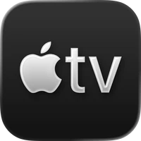
At the fag end of 2019 (September), the redesigned Apple TV logo for iOS featured a similar design to its previous iteration, but the colour palette was changed from turquoise green to plain white. Also, the contours of the Apple symbol and the “TV” lettering were refined to make them look stricter.

(2025)
The 2025 logo iteration refined the previous logo by adding a grey gradient to the logo elements within the black square. However, the outline of the elements was strictly white.
(2025 – Present)
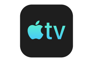
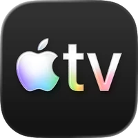
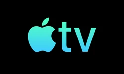
The current logo was introduced on November 3, 2025, with the iOS 26.1 variant. It shows the previous logo elements (the Apple symbol and the wordmark) in multicoloured gradients. The white, purple, green, blue, and pink colours add a shine to the logo.
macOS
The Genesis of the Apple TV (macOS) App Logo (2019) (Unused)
The first Apple TV macOS App logo was introduced in 2019 as a beta version. It featured a solid black circle with a matte frame containing the Apple symbol and the “TV” inscription in a gradient turquoise colour scheme.
(2019 – 2020)
In the subsequent logo iteration, the turquoise colour scheme was replaced with white and the letters of the inscription “TV” were made slightly bigger. Rest of the logo elements remained untouched.
(2020 – 2025)
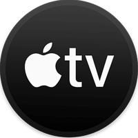
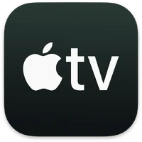
The 2020 macOS logo saw the outer black circle with a matte outline replaced with a black square with rounded ends. The Apple symbol and the lettering appeared in white, like its previous iteration. The lettering was executed using a sans-serif typeface.
(2025)
The 2025 logo iteration was a repetition of the iOS logo of the same year. In other words, the Apple symbol and the lettering were rendered in grey gradient colour with white outlines.

(2025 – Present)
Introduced on November 3, 2025, for the macOS 26.1 version, the logo shows the previous logo elements (the Apple symbol and the wordmark) in multicoloured gradients. The addition of white, purple, green, blue, and pink colours brought shine to the logo.

tvOS
The Genesis of the Apple TV (tvOS) App Logo (2016 – 2019)
tvOS was designed as a platform by Apple for its digital media player to enable viewers to watch large-screen entertainment, streaming, and smart home integration. The first tvOS logo was similar to the first iOS logo as far as depicting the gradient turquoise green TV screen with a white framing was concerned. However, the tvOS logo used a horizontally stretched solid black rectangle as the background instead of the square background of the iOS logo.

(2019)
In this iteration, the TV screen at the centre was replaced by the Apple emblem and the “tv” lettering in lowercase. Compared to the iOS version, the coloured elements were slightly larger in size, which made the logo look strong.
(2019 – 2025)
Similar to other Apple TV logo changes, the tvOS variant also saw the colour palette of the central elements change from gradient turquoise to white. However, the size of the elements remained the same.
(2025 – Present)
Introduced on November 3, 2025, the logo redesign was consistent across all platforms. The central elements of the logo saw a sweep of multicoloured gradients and formed a distinct visual identity.

TV Streaming Service
The Genesis of the Apple TV Streaming Service Logo (2007 – 2014)
The first model of the Apple TV media players were introduced in 2007. Alongside it appeared the logo consisting of the Apple symbol and the “tv” lettering in bold black against a white background. In the lettering, “t” had its horizontal upper left segment a little shorter compared to the right one.

(2014 – 2016)
In the 2014 logo variant, the strokes and characters of the letters were made thin. Also, the horizontal upper right segment of the letter “t” was lengthened.

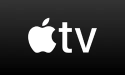
(2016 – Present)
In this logo version, the horizontal bar of the letter “t” appeared even. The rest of the elements remained the same.

(2019 – 2025)
The year 2019 saw the debut of the Apple TV+ service logo. Here, an additional “+” sign was introduced and placed right next to the “tv” lettering. This signifies Apple’s foray into the streaming world. The “+” sign means the streaming platform has enhanced features and a range of content offerings.

(2025 – Present)
In the latest logo design, the “+” sign has been removed, and the streaming platform will simply be called Apple TV. The new logo features multicoloured gradient elements (Apple symbol and the wordmark). The redesigned visual identity is meant to encompass the streaming service within the broader Apple ecosystem.

The Elements of the Apple TV Logo
Font
The wordmark “TV” to the right of the partially bitten apple is written in bold San Francisco Compact typeface. Specially designed for the Apple Watch, this typeface features symmetry and adequate spacing between letters. Featuring no serifs, the letterforms are of the same thickness.
Colour
The Apple TV logo uses a multicoloured palette with a gradient.
Finally
Apple has undertaken various iterations to the Apple TV logo. These show the brand’s journey from a simple media streamer to a cornerstone of Apple’s digital ecosystem. Each iteration of the logo has aligned with the design philosophy of Apple, which is clean, modern, and instantly recognisable, when adapting to new devices, services, and platforms like tvOS and Apple TV+. The Apple TV logo represents Apple’s commitment to redefining how people watch, play, and connect through technology.