Google Maps is one of the most widely used digital mapping and navigation platforms in the world. It was developed by Google to help users explore, navigate, and understand the world around them. Launched in 2005, it has evolved from a simple online map service into a comprehensive tool that provides a plethora of information. This includes real-time navigation, street-level imagery, satellite views, and location-based recommendations.
Google Maps covers over 220 countries and territories, and it enables users to do a host of things. These include finding directions, discovering local businesses, checking traffic conditions, and even exploring distant places through Street View and 3D imagery. It integrates advanced technologies like artificial intelligence, machine learning, and augmented reality to offer personalised and accurate mapping experiences. The logo of Google Maps has evolved over a period of time, and it chronicles the various phases of the brand and its transformation. The article explores the logo evolution of Google Maps, among other details.
The Genesis of the Google Maps Logo (2004 – 2005)
The first version of Google Maps was briefly named Google Local, which was reflected in its logo as well. Written in the corporate serif font, the word “Google” with the bevelled “e” was executed in its iconic colour scheme. The letters of the wordmark had blurred grey shadows and a gradient. And below the twin o’s of the Google wordmark was written “Local” in yellow using a bold sans serif typeface. Also, to the right of “Local”, “BETA” was mentioned in pale grey uppercase.

(2005)
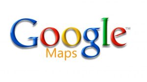
Google Maps as a platform was created in 2005, and its logo with the platform’s name featured the iconic multi-coloured logotype. Below it was placed the word “Maps” in yellow, while to the right of the letter “g” was mentioned “BETA” in grey uppercase.

(2005 – 2006)
The year 2005 (6th October) saw the merger of Google Maps with Google Local, which was reflected in its iconic logo. In this logo variant, the word “Local” in a yellow title case resurfaced without the wordmark “BETA”.

(2006 – 2009)
The 2006 logo saw the return of the old “Maps” design, but without the “BETA” wordmark. This logo rebranding was necessitated due to the expansion of the application to several countries, such as Canada, Germany, and the UK.
(2009 – 2010)
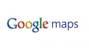
The 2009 variant saw the addition of the lowercase word “maps” in blue to the right of the iconic Google wordmark.
(2010 – 2013)
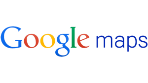
In this logo version, which coincided with the introduction of Google’s new logo, the grey shadows around individual letters of the Google wordmark were removed. The gradient was made less pronounced, which made the logotype look simple, flat, minimalist, and bright.
(2013 – 2015)
In 2013, the gradient in the logotype was removed to a large extent. Besides, the vestiges of the remaining 3D elements, namely, volume, shading, and texture, were removed.
(2015 – 2020)
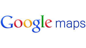
In the 2015 logo, the typeface used to render the “Google” wordmark was bold grotesque sans-serif. Also, the second half of the logotype, “Maps”, in grey, was written in a title case.

(2020 – 2025)
The year 2020 saw the transformation of the logo as the platform celebrated fifteen years of its existence. In this version, a graphical emblem in the form of a location marker or pin, a drop-shaped symbol, appeared to the left of the wordmark. The location marker with a round hole at its core was designed in the signature Google colours of red, blue, yellow, and green. The pin symbol with diagonal partitions had two shades of blue. The name of the platform was rendered to the right in grey.

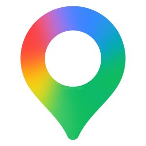
(2025 – Present)
The Google Maps logo will be revamped, keeping in view the recent transformation of the Google favicon “G” into a gradient style. The Google Maps icon still shows as a pin, but it has been made thinner and modernised. Besides, the inner circle has been made bigger, and the diagonal partitions of the earlier logo have been gotten rid of. The subtle changes made to the Google Maps icon include the addition of a smooth, gradient colour scheme.
The Elements of the Google Maps Logo
Font
The wordmark in the Google Maps logo is written in grey using the grotesque, geometric Product Sans typeface, which is characterised by a bevelled “e”.
Colour
The Google Maps logo is designed using a combined colour palette of red, yellow, blue, and green with gradients.
Finally
The evolution of the Google Maps logo shows how the platform grew from a simple mapping tool to a sophisticated, AI-driven navigation and discovery system. Over the years, the logo has transitioned from a detailed map marker design to a clean, minimalist pin symbol. It reflects Google’s broader shift toward simplicity, accessibility, and modern visual identity.