Realme is a Chinese technology brand that designs and manufactures smartphones, AIoT devices, and lifestyle products, with a special focus on performance, design, and affordability. It was founded on May 4, 2018, by Sky Li (Li Bingzhong), a former OPPO executive, and began as a sub-brand under OPPO before emerging as an independent company.
The brand was created to cater to the needs of the younger generation, and it offered cutting-edge technology and stylish designs at competitive prices. The Realme logo has evolved over a period of time and depicts the journey of the company from a sub-brand of OPPO to a global brand. The article explores the various logos designed by the company since its inception, among other details.
The Genesis of the Realme Logo (May – November 2018)
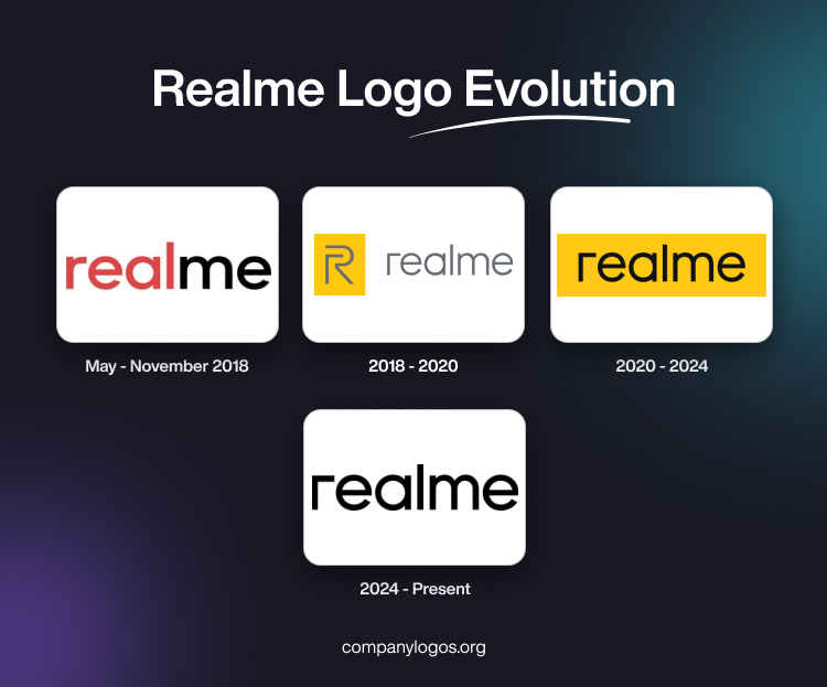
Launched on May 4, 2018, the original Realme logo featured the brand name in lowercase and in a custom sans-serif typeface. Here, the letters of the wordmark were characterised by their prominent vertical stubs. Interestingly, the brand name was displayed in twin colours, where the first half “real” was displayed in red, while the last two letters were displayed in black.

(2018 – 2020)
Designed by Eddie Opara, Chief of Design, Pentagram, the next iteration of the Realme logo featured a combination of a graphical motif and the wordmark. A stylised letter “R” in grey against a yellow rectangular background formed the motif. Interestingly, the left element of the motif formed the first letter of the wordmark “r”. The wordmark was written using a simple, minimalist, and custom sans-serif typeface in grey.

(2020 – 2024)
The subsequent logo of 2020 did not have the graphical motif, while the wordmark in black was set against a horizontally oriented rectangle in yellow. The typography of the wordmark was similar to the one used earlier.

(2024 – Present)
The current logo in black retains the previous styling but against a white background.

The Elements of the Realme Logo
Font
The wordmark in the Realme logo is executed using a custom, clean, bold, and geometric sans-serif typeface. The rounded letterforms look modern, confident, and approachable. The letter “r” is distinctive and conveys minimalism and simplicity. The typeface used has similarities with Futura or Poppins typefaces.
Colour
The Realme logo uses a monochrome colour palette of black against a white background for greater contrast and visibility.
Finally
The evolution of the Realme logo shows the journey of the brand from a bold newcomer to a confident global technology leader. Each logo redesign reflects Realme’s growing maturity and ambition. In fact, the signature yellow colour, symbolising optimism and vitality, has remained a consistent hallmark of the logo. It reinforces the brand’s connection to a youthful, forward-thinking audience.