Google Photos is a cloud-based photo and video storage, sharing, and management service developed by Google. It was launched on May 28, 2015, and was created to help users organise, back up, and relive their memories effortlessly using the power of artificial intelligence. Google Photos automatically backs up media from smartphones, tablets, and computers. It ensures users’ cherished moments are safely stored and easily accessible across all devices.
What sets Google Photos apart is its smart organisation and search capabilities. Using advanced AI and machine learning, the platform can recognise faces, objects, and locations. It allows users to find specific photos just by typing keywords like “dog”, “birthday”, or “beach”. It also offers a variety of creative tools such as photo editing, automatic collages, animations, and the Memories feature, which resurfaces old photos to help users revisit special moments.
Over the years, Google Photos has evolved into a comprehensive digital memory hub. It has integrated seamlessly with Google’s ecosystem and offers features like Magic Eraser, Google Lens, shared libraries, and photo books. The Google Photos logo is a kaleidoscope of colours and has evolved over the years. The article delves into the journey of the Google Photos logo, among other details of the brand.
The Genesis of the Google Photos Logo (2011 – 2013)
Google Photos used to be called Google+ Photos, the logo of which showed two triangular elements in different sizes standing alongside. Giving the impression of twin mountain peaks, the left triangular element appeared in dark blue and white colours. The right one appeared a more transparent shadow of the former. The two triangular elements were set against a light blue square background and further enclosed within a thick light grey outline to look like a photo frame. The logo emphasised the function of storing and organising photos the service entailed.

(2013 – 2015)
In 2013, the logo featured a stylised pinwheel consisting of four angular petals in red, yellow, green, and blue. Created in dark and light shades of each individual colour, the petals formed a white star at the centre, which symbolised a camera flash.

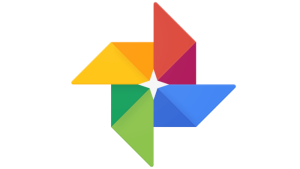
(2015 – 2020)
The next iteration of the Google Photos logo retained the earlier design of four angular petals in red, yellow, green, and blue. In this logo, the shades were made a little lighter compared to the earlier one. Although the logo appeared complicated and cluttered, it evoked a sense of being dynamic and technical. The arrangement of the sharp angular petals created a tiny 4-pointed star in white at the centre.
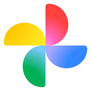
(2020 – 2025)
The 2020 logo iteration saw the triangular-shaped flower petals of the previous logo turn into semicircular petals of the same colours. However, the dark and light shades of the previous logo were replaced with a logo of uniform colours. The graphical emblem was followed by the brand name in a grey title case and executed using a simple and rounded sans-serif typeface. Thus, the 2020 logo featured a softer and more fluid look.

(2025) (10th Anniversary Logo)
The 10th anniversary logo of Google Photos in 2025 continued with the 2020 edition but added thick, bold, voluminous, and geometric numbers “10” in black alongside. The numerals had a few geometric symbols sprinkled at their top right side in the colours of red, yellow, blue, and green.
The symbols were a circle, a triangle, a square and a rectangle with rounded corners. The shape of the rounded numerals was distinct, with the left side of “0” featuring a somewhat straight line instead of the curved one. Even the circle inside the “0” looked more like a closing parenthesis in white.

(2025 – Present)
The Google Photos logo in 2025 is set to retain the same icon, but the gradient colour scheme will envelop it from the inside out. The transparent look of the inner portion of the icon will become apparent when it is enlarged.
The Elements of the Google Photos Logo
Symbol
The Google Photos icon looks like the windmill, a children’s toy, or a stylised flower. It consists of four semicircular-shaped petals in different colours with a gradient.
Font
The wordmark that forms part of the Google Photos logo is written using a simple, minimalist, and modern sans-serif typeface. The letters of the wordmark are characterised by clean and neat lines. Besides, they are balanced in terms of spacing and size. The similar typeface includes Pulp Display Light and Glence Medium.
Colour
The colour palette of Google Photos comprises a combination of blue, green, red, and yellow with a gradient. Here, blue conveys responsibility and reliability, while red is about passion and love. Also, green conveys growth and success, while yellow evokes friendliness and happiness. The grey-coloured brand name evokes a sense of professionalism and stability.
Finally
The Google Photos logo and its iterations reflect the brand’s journey from a simple photo storage service to an intelligent, emotion-driven platform for preserving memories. The logo was originally inspired by the colourful pinwheel design and symbolised joy, creativity, and the dynamic nature of capturing life’s moments. Over time, subtle refinements were introduced to align the icon with Google’s Material Design principles and the company’s unified visual identity.