Mozilla Firefox is a globally recognised, open-source web browser developed by the Mozilla Foundation and its subsidiary, Mozilla Corporation. It was first released in 2004 and quickly gained popularity for its speed, security, and strong commitment to user privacy. These qualities helped it become a trusted alternative to mainstream browsers.
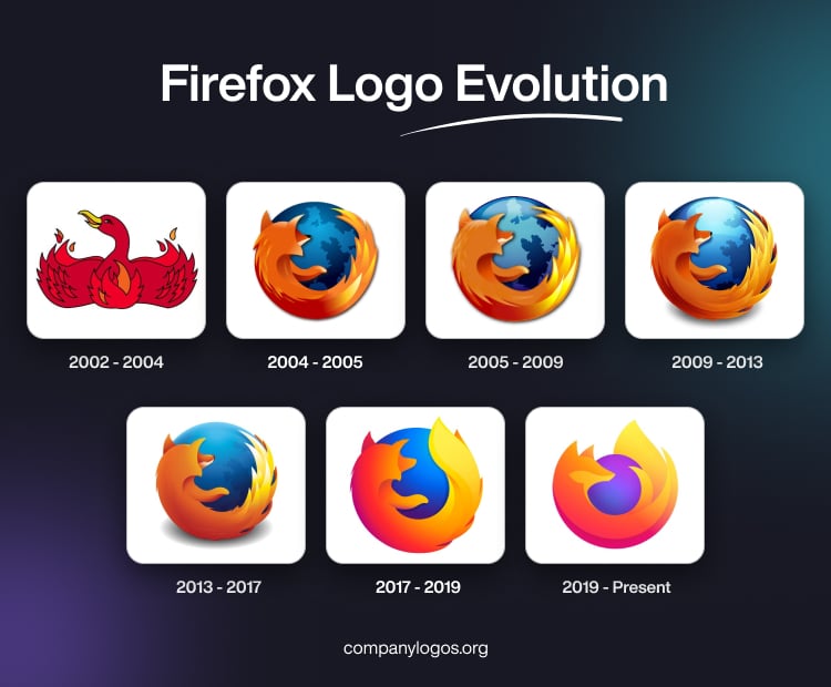
Firefox was built on the principles of openness and innovation and was designed to give users greater control over their online experience. It introduced pioneering features such as tabbed browsing, pop-up blocking, and customisable extensions, which later became industry standards. The logo of Firefox has evolved over a period of time and highlights the journey of the brand from a simple browser to a full-fledged internet ecosystem. The article explores various logo designs that Firefox has undertaken over the years, among other details of the brand.
The Genesis of the Firefox Logo (2002 – 2004)
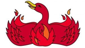
The initial Firefox logo was created for Phoenix, its predecessor. It showed a stylised red bird with its wings stretched sideways. The flame-like elements in shades of red spread across the wings resembled a flame to symbolise Phoenix’s “rise from the ashes”. The head of the bird with a yellow-coloured beak was turned left and had a friendly appearance.
(2004 – 2005)
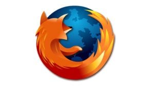
In 2004, the Phoenix browser was renamed Firefox due to trademark issues, which necessitated a change in the logo. The new logo featured a blue globe with gradient shades having a stylised orange fox curled along the middle and bottom part of the globe. Interestingly, the fluffy tail of the fox with sharp pointed accents resembled a flame.
(2005 – 2009)
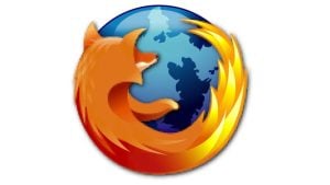
In the 2005 variant, the globe and fox emblem was redefined. The fox image was made more detailed, while the colour palette became brighter. In fact, the subtle refinement and digital tweaks had more to do with adapting to the digital age.
(2009 – 2013)
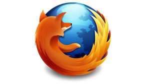
The follow-up logo in 2009 made the logo emblem look three-dimensional and glossy. With lighter gradients, the globe was refined further. The iconic fox imagery of the logo bore testimony to the brand’s consistent vision.
(2013 – 2017)
The Firefox logo was refurbished in 2013 to make it appear simpler and flatter. All accents of the fox were moved to its tail, and the fox rendering became more abstract. The subtle alterations showed Firefox’s desire to stay updated and relevant in the dynamic digital landscape.
(2017 – 2019)
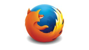
The 2017 logo design had smooth wide lines without any sharp triangular elements, especially at the fox’s tail. The colour of the globe became brighter, while the contours of the continents on the globe were done away with. In fact, the blue background of the globe was made plain and gradient.
(2019 – Present)
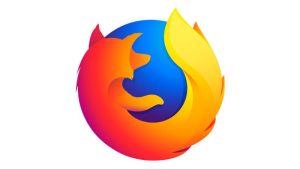
The current logo was introduced in 2019, wherein the size of the gradient globe became smaller and the blue colour turned purple. The enlarged fox almost covers the whole globe and looks tender and friendly. The foxtail is shown to be fluid, elegant, and sleek.
The Elements of the Firefox Logo
Symbol
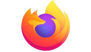
Although the name Firefox is associated with “fox” and which appears in the logo as the mascot, the red fox is in reference to a red panda.
Font
The wordmarks “Mozilla” and “Firefox” are written using a simple sans-serif typeface FF Meta Bold Roman, developed by Erik Spiekermann. It complements the visual aesthetics of the accompanying graphical emblem. The letterforms are sharp and modern and easily recognisable. However, Firefox has not focused much on its wordmarks as its recent designs are devoid of any inscriptions.
Colour
The colour palette of the Firefox logo is eye-catching and consists of a combination of blue, orange, and yellow. Here, orange symbolises the passion driving the Mozilla community, while blue symbolises the vast expanse of the internet.
Finally
The Firefox logo has evolved from a realistic fox circling a globe to a sleek, abstract flame symbol. It shows the transition of the system from a simple browser to a broader privacy-focused ecosystem.