Soundcore is the premium audio brand under Anker Innovations, which is a global technology company known for its expertise in producing charging solutions and smart consumer electronics. Soundcore was established as a sub-brand in 2014, and it focuses on delivering high-quality, affordable audio products. These products combine advanced acoustic engineering with cutting-edge wireless technology.
The brand’s portfolio includes Bluetooth speakers, true wireless earbuds, over-ear headphones, and smart audio devices. Soundcore designs all its products to offer an immersive and reliable listening experience. Soundcore has built a reputation for its signature technologies. These include BassUpTM for enhanced low frequencies; HearIDTM for personalised sound calibration; and ACAATM (Astria Coaxial Acoustic Architecture) for studio-quality audio reproduction. The article explores the evolution of the Soundcore logo, among other details of the company.
The Genesis of the Anker Soundcore Logo (2014 – 2017)
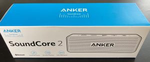
In 2014, Soundcore used to appear with Anker, as it was an audio line under the Anker umbrella. The wordmark “Soundcore by Anker” or “Anker SoundCore” was executed using a minimalist, semi-bold sans-serif typeface with tighter spacing and an angular tilt. Here, the word “Anker” mostly dominated the logo, and “Soundcore” appeared as a sub-brand.
(2018 – 2021)
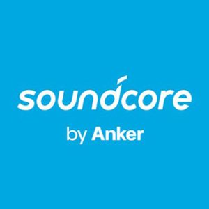
In 2018, Soundcore acquired its brand positioning and became an independent brand under the umbrella of Anker. The standalone logo featured a blue or white wordmark against a blue background in lowercase and was often accompanied by a much smaller wordmark, “by Anker”. The slightly slanted and roundish letterforms were written using a custom sans-serif typeface. In the wordmark, the stylish letter “d” had a small dash at its top.
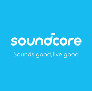
(2022 – Present)
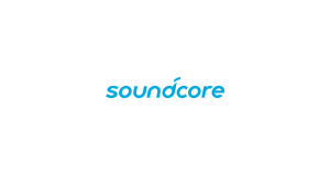
In 2022, Anker Soundcore introduced a new logo and it continues to this day. Consisting of an emblem and a wordmark, the logo reflects the inspiring, inclusive, and ever-evolving spirit of the company. The emblem in blue appears like a stylised musical note in the shape of the letter “d” along with the wordmark. The wordmark is followed by the tagline “Sounds good, live good,” which embodies the qualities the company look to deliver.
The Elements of the Anker Soundcore Logo
Font
The lowercase wordmark in the Soundcore logo is executed using a custom rounded sans-serif typeface. The letters of the wordmark are characterised by their softness and for conveying a sense of fluidity and friendliness. The treatment given to the letters “d” and “a” adds a unique identity to the wordmark.
Colour
The colour palette used in the design of the Soundcore logo includes a bright cyan blue, aka Soundcore Blue. The colour symbolises clarity, energy, and innovation. These qualities embody the liveliness of music and the innovation of modern technology.
Finally
The evolution of the Anker Soundcore logo shows the growth of the brand from a promising subdivision of Anker Innovations into a globally recognised name in personal audio technology. So, from its early, product-focused insignia to the sleek, modern wordmark used today, each logo redesign reflects Soundcore’s commitment to clarity, innovation, and emotional connection through sound.