Seiko Optical Products is a renowned global manufacturer and innovator in the optical industry. It specialises in manufacturing high-tech eyeglass lenses, frames, and related eyewear solutions. Belonging to the esteemed Seiko brand known for precision and quality, Seiko Optical Products has built a legacy of excellence of its own. Its history dates back to its origins in Japan, where the company was founded by Kintaro Hattori in 1881.
The core focus of the company is on producing advanced optical lenses. These include progressive, aspheric, and high-refractive-index lenses. Further, there is a wide gamut of ophthalmic frames. The commitment of the company to precision and technological innovation has made it a trusted name among eye care professionals and consumers worldwide. The article delves into the evolution of the Seiko Optical Products, among other details of the company.
The Genesis of the Seiko Optical Products Logo (Pre-1996)
Arguably the first logo of Seiko Optical Products featured the “SEIKO” wordmark and the extended text “Optical Products of America, Inc.” It was made specifically to brand the optical products produced by the company, such as the progressive lenses, in the expanded markets of the USA. The logotype showed a bigger wordmark “SEIKO” in blue and executed in a slab serif typeface. The extended text below was written in black and in a title case using a sans-serif typeface.

(1996 – 2010s)
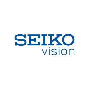
During this period, the logo usually had the descriptor “VISION” or “Precision for Vision” alongside the brand name “SEIKO” in blue or white. Here, the “VISION” descriptor was often used on product pages, especially in eyewear listings.
(2010s – Present)
The current logo was designed in 2010 and it features the SEIKO wordmark along with the descriptor “PRECISION FOR VISION” in two levels. Here, the bigger sized wordmark “SEIKO” in uppercase is executed in a slab serif typeface, while the descriptor in a smaller size uses a simple sans-serif typeface in uppercase.

The Elements of the Seiko Optical Products Logo
Font
The wordmark forming the logo of Seiko Optical Products is executed in uppercase using a slab serif style typeface. The letters are characterised by block-like serifs, and where the letters “E”, “K”, and “O” show thick stems and distinct horizontal feet. The font similar to this is Warrior Bold slab serif. The solid letters of the wordmark are evenly spaced and evoke an engineered feel. Besides, the use of slab serifs gives the logo solidity, which is right for an optical brand dealing with high-precision products.
Colour
The colour palette of the Seiko Optical Products logo uses a black and white combination. However, in some materials, the wordmark is also shown in blue. Here, black provides high visibility and high contrast, while blue is associated with trust, technology, and clarity.
Finally
The evolution of Seiko Optical Products’s logo serves as a visual reflection of the company’s guiding philosophy of precision, clarity and continuity. So, from its origin under the parent Seiko Holdings Corporation (and predecessor firms) to its current presence in the eyewear and lens market, the logo has retained a remarkably consistent identity while adapting to new applications and audiences.