Rodenstock GmbH is a renowned German manufacturer of ophthalmic lenses and spectacle frames and is celebrated for its precision optics and innovative vision technologies. Based in Munich, Germany, the company was founded in 1877 by Josef Rodenstock and has since grown into one of the world’s leading vision care specialists.
Rodenstock’s expertise lies in combining medical knowledge with engineering excellence. It offers customised lens solutions to enhance visual performance and comfort. With a strong presence in over 85 countries, the company integrates advanced technologies such as biometric intelligent glasses (B.I.G. Vision®) to tailor lenses based on individual eye measurements. The article explores the Rodenstock GmbH logo and its variants, among other details.
The Genesis of the Rodenstock GmbH Logo (1877 – 1906) (Unavailable)
The earliest Rodenstock GmbH logo and its variants are not publicly documented. However, they are most likely to be text-based in black and written in a traditional font of that era.
(1906)
Arguably the first documented visual identity of Rodenstock GmbH was in black cursive and hand-drawn. The letters were characterised by stylish strokes and they projected subtle serifs.
(1916)
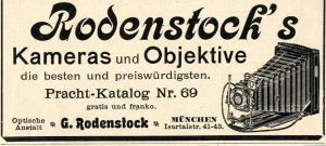
Among the next documented mentions of the visual identity was in 1916, and it contained the word “RODENSTOCK” in uppercase with rounded contours. The wordmark was probably handwritten.
(1923)
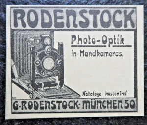
The next iteration of the visual identity could be seen in the year 1923, and it consisted of the text “RODENSTOCK” in uppercase. The thick, bold, and geometric letters of the wordmark in black had roundish ends.
(1991 – 2010)
In 1991, Rodenstock GmbH introduced the “R” symbol as its logo and trademark. The stylish yet large-sized letter “R” stood as a symbol of innovation and precision. The letter “R” in a light blue colour scheme was followed below by the brand name in grey and written using a clean, modern, and geometric serif typeface.
(2010 – Present)
The 2010 logo iteration saw the refinement of the previous logo. The symbol “R” and the wordmark turned black in colour. However, the styling of the symbol and the wordmark remained the same.

The Elements of the Rodenstock GmbH Logo
Font
The wordmark used in the Rodenstock GmbH logo is written using a clean, modern, and geometric serif typeface. The use of the font makes the logo appear professional and high-tech.
Colour
The Rodenstock GmbH logo uses a shade of teal or turquoise to symbolise trust, innovation, and high quality.
Finally
The evolution of the Rodenstock GmbH logo reflects the company’s commitment to precision, innovation, and optical excellence. Each logo iteration reflects the journey of the company over the years, including its growth and technological progress. The current minimalist “R” emblem embodies clarity, confidence, and vision. In other words, it symbolises the values that define the brand’s leadership in the global eyewear industry.