10×10 An Italian Theory is a vibrant Italian fashion label that was born out of culture and craftsmanship. It was founded by Alessandro Enriquez who was a Sicilian-born creative designer with French-Tunisian roots. The brand blends a rich Italian heritage with a playful, graphic aesthetic. The brand story begins in 2012 when Enriquez published a book titled 10×10 – An Italian Theory.
The book featured ten interviews with influential Italian personalities. The conceptual project laid the groundwork for the brand’s name and ethos. In 2013 the label was officially launched, and it initially focused on accessories and later evolved into full men’s and women’s ready-to-wear lines. At its core, 10×10 An Italian Theory champions handmade “Made in Italy” craftsmanship, especially in Tuscany. At the same time, it embraces bold colours, whimsical graphic prints and Italian-icon inspired motifs, such as ice-cream cones, lucky charms and food references.
The brand stands apart in the fashion world by weaving together narrative (the book origin), lifestyle (Italian culture), and luxury (artisanal production) into a singular expressive aesthetic. The logo of 10 x 10 An Italian Theory speaks volumes about its journey, evolution, and commitment to excellence. In this article, we delve into the logo, among other details of the company.
The Genesis of 10 x 10 An Italian Theory Logo (2015 – Today)
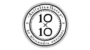
The official logo of An Italian Theory is circular in shape with the text “10 x 10” written inside in three levels. The circle has several outlines – the inner one using consecutive dots followed by a thick black one. The outer periphery consists of three outlines, one made of a thin black line, another of consecutive dots, and a thick black one thereafter. The space between the two thick black outlines is covered by the wordmarks “An italian theory” and “by alessandro enriquez” in a customised condensed font with narrow spacing between characters.
The Elements of The 10 x 10 An Italian Theory Logo
Symbol
The 10 x 10 An Italic Theory logo features a circular graphical symbol with several outlines in black.
Font
The wordmark used in the logo uses a custom designed, condensed, serif typeface in a title case. The letters of the wordmark are characterised by narrow spacing and a little condensed.
Colour
The logo is designed using a black and white colour scheme, which enhances the heritage feel. Besides, the black colour stands in sharp contrast against a white background.
Finally
The logo of 10 x 10 An Italian Theory did not change even once since the founding of the brand. Its consistent presence is a testament to the brand’s ability to adapt, innovate, and remain at the forefront of the fashion industry. From its humble beginnings in the mid-20th century to its current status as a global fashion icon, the 10×10 An Italian Theory logo has transformed in tandem with cultural shifts, customer choices, and design trends.