Bausch & Lomb is one of the premier eye health companies in the world and is known for its rich legacy of innovation in optics and eye care. It was established in 1853 in Rochester, New York, by German immigrants John Bausch, an optician, and Henry Lomb, a cabinet maker who became the company’s early financial backer. Bausch & Lomb began as a small optical shop but quickly became famous thanks to its pioneering advances in eyeglass frames, microscopes, photographic lenses, and later contact lenses.
Bausch & Lomb offers a comprehensive portfolio of eye health products that includes contact lenses, lens care solutions, surgical devices, and ophthalmic pharmaceuticals. The company has introduced products such as Ray-Ban aviator sunglasses for the military, the first optical glass in the United States, and innovative contact lens technologies. The article delves into the evolution of the Bausch & Lomb logo, among other details of the company.
The Genesis of the Bausch & Lomb Logo (1853) (Unavailable)
Bausch & Lomb was established in 1853 in Germany. However, there is no documented evidence of the logo of that period, and it most likely was a simple handwritten logotype denoting the company name “Bausch & Lomb Optical Co.”
(1879)
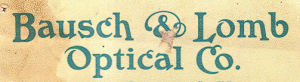
The earliest visual identity can be found in a catalogue for microscopes. It showed the brand name in an ornate handwritten typography in black, where the first letters of “Bausch & Lomb Optical Co.” were displayed stylishly.
(1892)
Another visual design of the company can be found in an illustrated catalogue of microscopes. It featured the company name in uppercase and written using a thin classic sans-serif typeface. The individual letters of the logo were elongated and appeared to be in symmetry.

(1904)
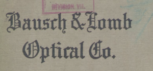
The visual design during this period was depicted in a title case and written using a serif typeface. The first letters of the wordmarks were bigger in size and appeared to go below the standard baseline.
(1923)
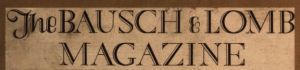
Another visual design of the company can be seen in the Bausch & Lomb magazine published between 1923 and 1928. It just showed the brand name in uppercase with letters having subtle serifs.
(1965 – 1978)
During this period, the logo showed the brand name written in Eurostile typography. The brand name was characterised by bold letters and a thin ampersand sign. A graphical emblem followed the logotype, comprising a black inverted triangle enclosed within a circle with a black outline.

(1978 – 1990)
Written in Harry typography, this logo of 1978 featured the brand name in two levels. The bold and thick roundish letters in black had a thin “&” sign.
(1990 – 2004)
Designed by Lippincott & Margulies, the logo of 1990 was written using the Fenice typography. Here, the letters in two levels were characterised by pronounced serifs and possessed thick and thin dimensions.

(2004 – 2010)
Designed by FutureBrand, the logo of 2004 featured a tangential green and blue band and the wordmark “Bausch & Lomb” in black written using a modified Stone Sans Semibold typography.

(2010 – Present)
The 2010 logo saw the “&” sign replaced by a “+” sign. Designed by Pentagram, the logo used a custom Nobel BL typeface in green and blue colours. It also introduced an icon comprising the initials “B” and “L” separated by a “+” sign.

The Elements of the Bausch & Lomb Logo
Font
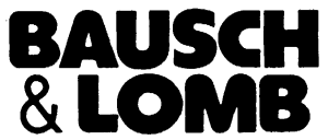
The wordmark that forms a part of the Bausch & Lomb logo is written using a proprietary clean and geometric typeface called Nobel BL, which is customised for the brand. The typeface supports the modern identity of the company.
Colour
The colour of the Bausch & Lomb logo includes green, teal, and turquoise accents. Here, blue and green evoke ecological sensibility for water and moisture.
Finally
The evolution of the Bausch & Lomb logo captures the spirit of a company that has consistently adapted and innovated in the fields of optics and healthcare. The earliest logos reflected Bausch & Lomb’s European heritage and commitment to technical excellence. These included historical emblems such as the “Triple Alliance” logo that united Bausch & Lomb, Saegmuller, and Zeiss early in the twentieth century. The Bausch & Lomb logo has come to signify clarity, medical credibility, and a commitment to vision innovation around the world. The logo reflects the journey of the company from a pioneering optical shop in Rochester to a global symbol of trust and advancement in eye health.