Carl Zeiss AG is a world-leading German company specialising in optical systems, precision mechanics, and optoelectronics. It has a rich legacy that dates back to its establishment in Jena in 1846 by Carl Zeiss. It is renowned for groundbreaking partnerships with scientists like Ernst Abbe and Otto Schott. In fact, Zeiss revolutionised lens technology and established itself as a pioneer in microscopy, camera production, and medical optics.
Based in Oberkochen, Germany, the company operates across nearly 50 countries and manages a global portfolio in industrial quality and research, medical technology, consumer markets, and semiconductor manufacturing technology. The article delves into the various logo iterations of Carl Zeiss AG, among other details of the company.
The Genesis of the Carl Zeiss AG Logo (1846 – 1868) (Unavailable)
The original logo of the company when it was founded in 1846 is not available.
(1868 – 1896)
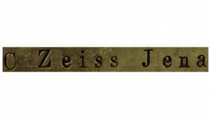
The logo that came about in 1868 and lasted up to 1896 featured the name of the company, “C. Zeiss Jena”, in a single line of text. Here, the word “Jena” referred to the town in Central Germany where the company was established. Written in a standard Times New Roman typeface, the logo was characterised by wide spacing between the letters and the words. There were two types of serifs defining the letters – pointed ones on “C” and “Z”, while flat-ended ones were on “i”, “s”, “J”, and “n”.
(1896 – 1906)
The 1896 logo saw the minimalist text-based logo in two levels. The top level read “Carl Zeiss Jena” in a thin, ornate, and elegant handwritten script, while the bottom level read “D.R.P”, which was short for “Deutsche Reichs Patern” or “Patent of the German Empire”. The abbreviation below was written in a geometric typeface with straight serifs. Both wordmarks were slanted to the right and symbolised the company’s drive for growth.

(1906 – 1972)
Designed by Emil Donitz, the 1906 logo featured a rectangle that is concave at the top and bottom. It contained the words “CARL ZEISS” and “JENA”, one below the other in equally divided parts. The wordmark in the upper half of the geometric figure had uneven height where the letters on the sides were shorter and taller in the middle. The wordmark in the lower half had uneven glyphs but was quite opposite when compared to the upper half. Here, the letters on the sides were taller than the ones in the middle. The font used in both the wordmarks was simpler and rounded.

(1972 – 1991)
The 1972 logo iteration was designed by Oskar Stark and it saw the wordmark in black uppercase reduced to “ZEISS” and written in a thick, bold, and blocky typeface. The massive symmetrical letters “Z” and “S” were mirror images of each other. The large glyphs of the letters had almost hid the serifs, which, in turn, looked more like small projections rather than expressive elements.

(1991 – Present)
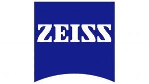
The current logo was designed in 1991 and features a white wordmark “ZEISS” against a blue square background concave at the bottom. The uppercase wordmark is written using a bold serif typeface, which is similar to Clarendon Black. The wordmark is characterised by symmetrical letters, smooth lines, short serifs, sharp corners, and gentle curves.
The Elements of the Carl Zeiss AG Logo
Font
The wordmark used in the Carl Zeiss AG logo uses a thick, bold serif typeface with big letters. It is similar to the Clarendon Black typeface, and the letters “Z” and “S” appear to be mirror images of each other. The near-symmetrical letters have straight lines and square angles. The font symbolises clarity and a commitment to precision.
Colour
The latest logo uses a combination of blue and white, where blue symbolises reliability and stability, while white conveys unity and loyalty.
Finally
For more than a century and a half, the Carl Zeiss logo has reflected its technological heritage as well as the changing context of its business. So, what began as a simple wordmark in the late 19th century evolved into a distinctive lens-shaped badge thereafter. Overall, the logo and its various iterations over the years show the company’s journey from a pioneering optics workshop to a unified global entity.