Whirlpool Corporation is one of the leading home appliance manufacturers in the world and is known for shaping how people live and work in their homes. It was founded in 1911 in Benton Harbour, Michigan, and has since grown from producing a single electric washing machine to offering a wide portfolio of innovative products. These included refrigerators, washing machines, ovens, dishwashers, and more. The article explores the various logo changes undertaken by Whirlpool Corporation over the years, among other details of the company.
The Genesis of the Whirlpool Corporation Logo (1911 – 1929)
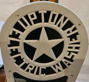
Long before Whirlpool Corporation came into being; it started as the Upton Machine Company that produced electric wringer washers. So, the first logo featured a solid five-pointed star in metal colour enclosed within a circle. It was further enclosed within a bigger circle with a thick outline. The wordmark “UPTON ELECTRIC WASHER” appeared in a circular alignment between the circles.
(1929 – 1949)
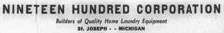
The Upton Machine Company had become the Nineteen Hundred Corporation in 1929. The company logo of that time featured the new company name in a bold black uppercase sans-serif typeface. The brand name was followed below by the tagline “Builders of Quality Home Laundry Equipment” in italics.
(1949 – 1960)
In 1949, the company name was changed to Whirlpool Corporation, and the logo saw the name displayed in a handwritten cursive script in black. It was followed by the wordmark “CORPORATION” in a smaller size in uppercase with adequate spacing between the letters.

(1960 – 1966)
The 1960 logo saw a huge black swirl appear above the stretched letter “W.” Furthermore, the glyphs forming the wordmark appeared as ripples on the surface of water. The wordmark “CORPORATION” in black uppercase appeared below as a tagline.
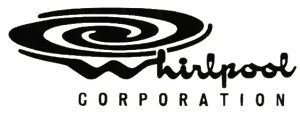
(1966 – 1985)
Since the brand name in the earlier logo was not legible, it was changed in 1966. Although the iteration was similar in style to the earlier one, the wordmark was executed using a classic serif typeface in black. The whirl above was much smaller and did not dominate the whole wordmark.

(1985 – 2010) (Primary), (2010 – 2014)
The logo design of this era saw the addition of a large golden oval diagonally across the brand name with classic serifs. The oval represented a “whirl” or “orbit”, while the wordmark “CORPORATION” appeared as a tagline below to the right.
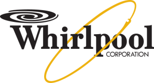
(2010 – 2017)
The wordmark in a title case here saw the removal of the serifs. Besides, the whirl above became thinner and smaller. The size of the golden oval became smaller as well. The tagline “CORPORATION” in uppercase is featured below, but to the right.

(2017 – Present)
The current logo does not feature the whirl symbol above, while the golden oval across the wordmark has become thicker. Further, the upper ends of the letters “h” and “l” display diagonal cuts.

The Elements of the Whirlpool Corporation Logo
Font
The wordmarks used in the Whirlpool Corporation logo use a modern, bold, and clean sans-serif typeface, which is similar to FS Silas Sans Bold. The bold and simple letters of the typeface convey clarity, accessibility, and forward thinking.
Colour
The colour palette used to depict the logo of Whirlpool Corporation includes black for the wordmark and universal yellow for the ring. Here, the yellow colour for the ring symbolises integrity, commitment to quality, and customer service. The black colour, on the other hand, symbolises reliability and strength.
Finally
The evolution of the Whirlpool Corporation logo reflects the journey of the company from humble origins to a global appliance leader. The logo design started with a warm, cursive-script wordmark in the early years. It reflected a personal, almost handwritten feel that resonated with the household context. Over time, the addition of the whirl symbol above the letter “W”, and later the gold orbit/ring around the wordmark, gave visual expression to the meaning of the brand name (“whirl”, rotation, movement) and underscored the technological progress and energy of the company.